Submitted by Taps Coogan on the 14th of April 2018 to The Sounding Line.
Enjoy The Sounding Line? Click here to subscribe for free.
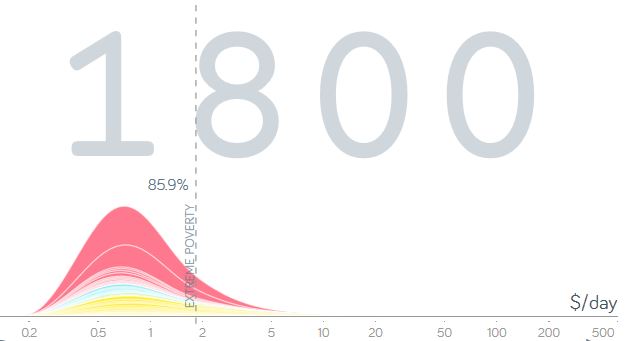
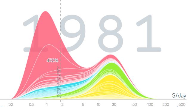
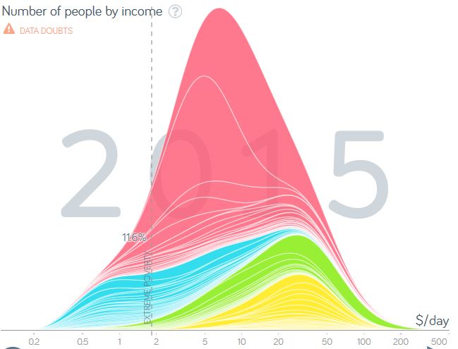
The following interactive chart, from Gapminder.org, shows the distribution of daily inflation adjusted income for countries around the world since 1800. By moving the slider or pressing the play button it is possible to see how the distributions have shifted, by country and continent, between 1800 and 2015. Pause the timeline and hover over the colored areas to select individual countries.
According to the chart, in the early 1800s, the vast majority of the world lived in what would be categorized as extreme poverty today.
 The populations of Europe and the Americas began to move up in income steadily from 1800 onward. Asia and Africa remained largely unchanged, though populations exploded. That continued until the early 1980s when Asia, and to a lesser extent Africa, began moving up in the wealth distribution.
 Today, the majority of the world’s population has been raised out of extreme poverty (though many remain extremely poor) and the global wealth distribution is the most geographically balanced that it has been since the early 1800s.
 As the chart itself notes, the data should be treated as estimates, not exact figures.
P.S. If you would like to be updated via email when we post a new article, please click here. It’s free and we won’t send any promotional materials.
Would you like to be notified when we publish a new article on The Sounding Line? Click here to subscribe for free.

