Submitted by Taps Coogan on July 25th 2016 to The Sounding Line.
Enjoy The Sounding Line? Click here to subscribe for free.
Many people use the terms ‘median’ and ‘average’ interchangeably when trying to represent the ‘typical’ value of a set of data. While it may seem trivial at first, the difference between a mean, also known as average, and the median of a data set can actually be quite revealing.
To understand why the difference between the two can be important in certain economic applications, let’s consider a highly simplified example.
Imagine that you live in a neighborhood with five homes. Two homes costs $100,000 each, two cost $200,000 each and one extraordinarily expensive home costs $15,000,000.
Someone is interested in moving into the neighborhood and asks: What does a typical home cost?
If you take the mean (aka average) of the home prices (sum of the prices divided by the number of homes) the average home price is $3.12 million dollars. The problem with that answer is that four of the five houses in the neighborhood cost $200,000 or less and the vast majority of home buyers are interested in the price of those homes, not the super mansion that cost $15 million.
However, the median of the home prices (the value separating the higher half from the lower half of the data) is $200,000. Two houses are less expensive ($100,000) and two houses are equal to more expensive ($200,000 and $15 million).
As this example highlights, using a median value ($200,000) reduces the effect of a single very expensive home (a statistical outlier) when trying to determine a typical home value for the neighborhood as compared to the mean/average house price ($3.12 million). The issue is one of statistical distortion and is an important consideration when trying to achieve results that are actually meaningful and revealing.
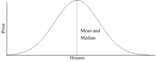
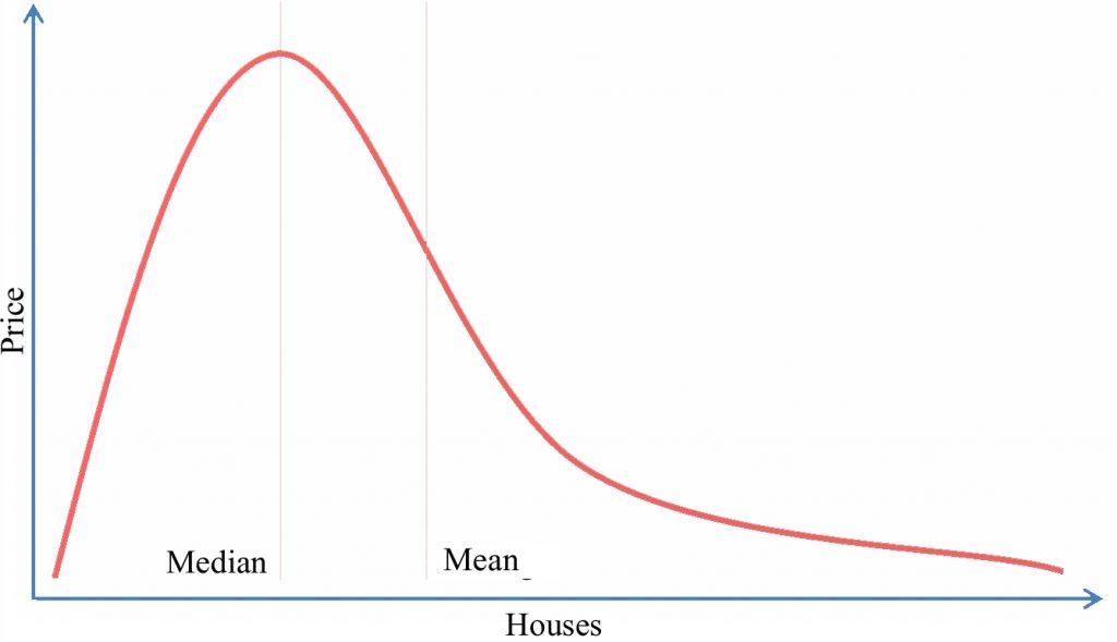
Generally speaking, the farther apart the mean and median value for a data set are, the more extreme the ‘outliers’ are and the less balanced the data is. People often refer to a bell curve. With a balanced bell curve (normal distribution), the median and mean values are the same.

When the distribution is skewed (in this example by a single very expensive home), the two values are separated.

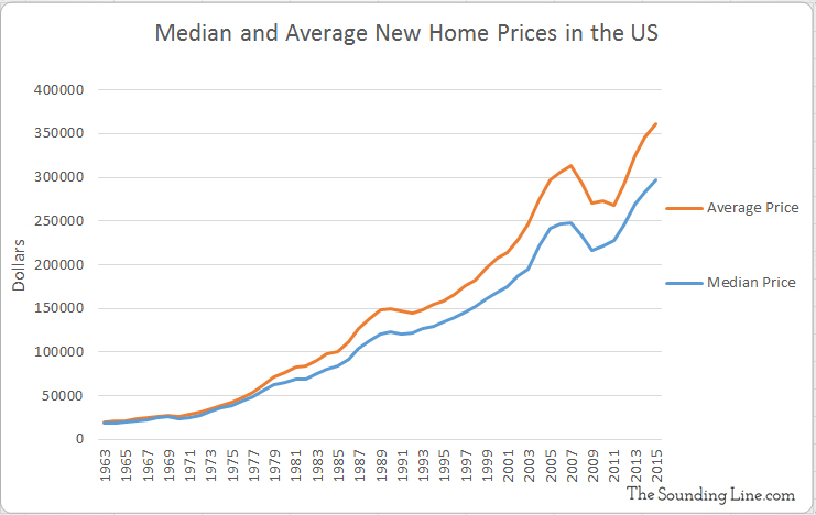
Why is this important? The United States Census Bureau has been keeping track of the average and the median prices of new homes sold in the US since 1963 and the data says something very important.

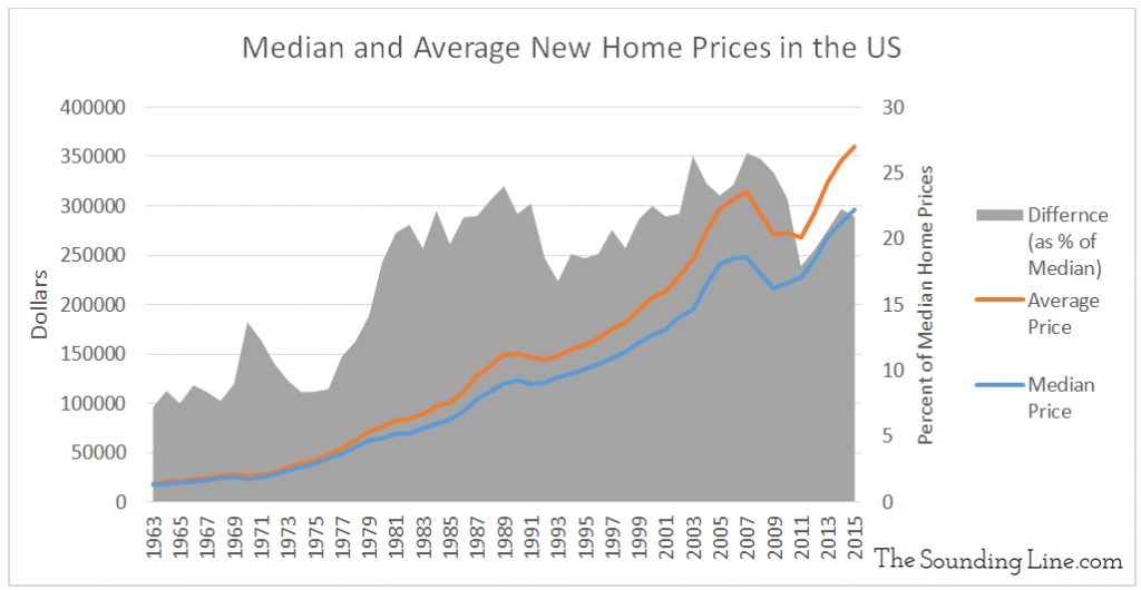
As the chart above shows, the average home price has always been higher than the median home price in the US. That is to be expected and is a result of the fact that there have always been some very expensive homes. What’s important, as the chart below shows, is that the gap between the median home price and the average home price has been steadily building as a percentage of median home prices. While it is not as high as its peak in 2008, the average home price is over 20% higher than the median home price and rising, compared to about 7% in 1963. That means that the distribution of home prices is increasingly skewed. In other words, there is a greater divide between the prices of most homes and the prices of the most expensive homes.

When we combine this observation with the fact that median household income has been declining in the US since 1999 (here), a picture of an increasingly divided and inequitable economy emerges.
Would you like to be notified when we publish a new article on The Sounding Line? Click here to subscribe for free.

