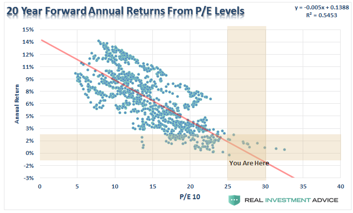
Lance Roberts, of Real Investment Advice, recently posted the following chart as part of a discussion about future returns on US equities in an article that we recently highlighted in our Top News Stories Column. While the full article is worth reading, the following chart alone speaks volumes about just how extreme current S&P 500 valuations are and what that means for future investment returns.
Enjoy The Sounding Line? Click here to subscribe for free.
The chart shows the 20 year forward annual return rates based on the price to earnings ratio (P/E) for every year since 1900, revealing a strong inverse correlation between P/E ratios and annual return rates over the following 20 years. From the chart, one can conclude that the higher the P/E ratio is this year, the lower annual returns are likely to be for the following 20 years.

The chart is particularly concerning because the current S&P 500 P/E ratio is approximately 25 (at the time of writing), nearly the highest level since 1900. This implies that annual returns over the next 20 years are unlikely to exceed 2.5%!
With the S&P 500 having already returned nearly 11% year-to-date, the current bull market is likely running on borrowed time. While that may continue to run for a while, the truly long term investor should take careful note of this chart.
P.S. We have added email distribution for The Sounding Line. If you would like to be updated via email when we post a new article, please click here. It’s free and we won’t send any promotional materials..
Would you like to be notified when we publish a new article on The Sounding Line? Click here to subscribe for free.

