Taps Coogan – November 18th, 2022
Enjoy The Sounding Line? Click here to subscribe for free.
Enjoy The Sounding Line? Click here to subscribe for free.
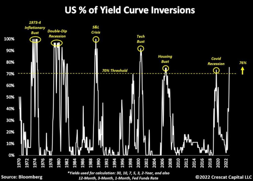
The following chart, from Crescat’s Tavi Costa, highlights the increasingly extreme level of treasury yield curve inversion.

The following chart from US Treasury Yield Curve shows the actual yield curve. Everything from 1-year to 10-years is inverted and the 30-year to 20-year is inverted too.

Despite understandable short-term buoyancy in markets after 11 months of bearish action and a better than expected inflation print, the classic leading indicators of recessions are flashing red.
Would you like to be notified when we publish a new article on The Sounding Line? Click here to subscribe for free.
Would you like to be notified when we publish a new article on The Sounding Line? Click here to subscribe for free.

