Submitted by Taps Coogan on the 17th of November 2017 to The Sounding Line.
Enjoy The Sounding Line? Click here to subscribe for free.
The following chart from ‘Our World in Data’ shows the change in the production and consumption, per capita, of 12 key economic, environmental, and social metrics since 1965.
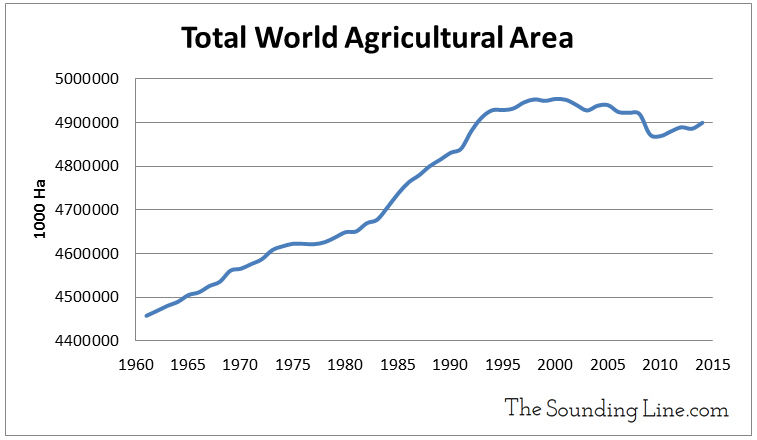
As the chart shows, the biggest increase since 1965 has been in global GDP followed closely by natural gas. Fertilizer, meat, primary energy, and calorie consumption have also increased, though more modestly. After increasing rapidly in the 1970s, fertilizer consumption appears to have plateaued since the late 1980s, as has oil consumption. Meanwhile, agricultural land, cropland, and freshwater use have decreased. This reveals an interesting dichotomy, which we first discussed in depth here. Not only is the population of the world growing, individuals are eating more calories and more agriculturally intensive foods like meat and dairy. Yet at the same time, the amount of land used for agriculture is declining, both in absolute terms and per capita. The simultaneous increase in food consumption and decrease in agricultural land has only been possible because of dramatic improvements in agricultural productivity. The key question is then: how long can agricultural productivity continue to grow if the area available for farming and the amount of fertilizer applied both appear to have hit a ceiling?

P.S. We have added email distribution for The Sounding Line. If you would like to be updated via email when we post a new article, please click here. It’s free and we won’t send any spam.
Would you like to be notified when we publish a new article on The Sounding Line? Click here to subscribe for free.

