Submitted by Taps Coogan on the 4th of February 2019 to The Sounding Line.
Enjoy The Sounding Line? Click here to subscribe for free.
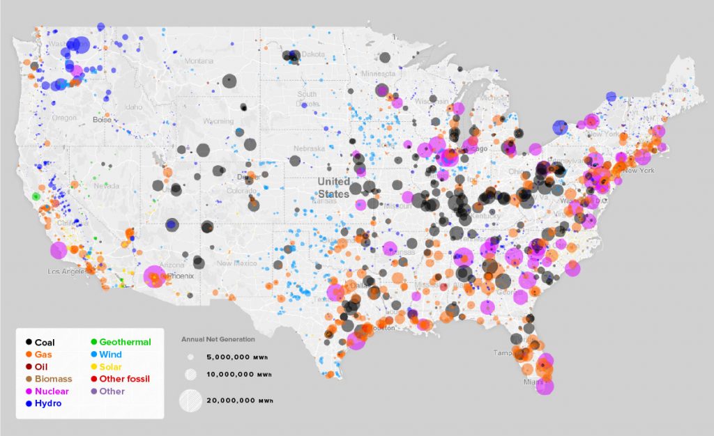
Ever wonder where your electricity comes from? The following map, from Weber State University, shows every significant power plant in the US as of 2016 (click on the image for an interactive version).

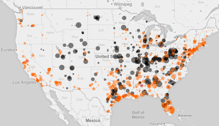
Fossil fuels:
Fossil fuels represent about roughly 60% of net US electricity generation, with coal responsible for 29.9% and natural gas responsible for 32.1%. Oil is used in less than 1% of electricity generation.

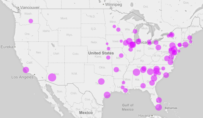
Nuclear:
Nuclear power plants produce roughly 20% of US electricity and are mostly located in the eastern half of the country where the higher population density justifies their very larger power capacity.

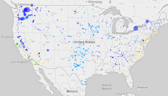
Renewable:
Hydro power remains the largest source of renewable energy in the US, producing roughly 7% of all electricity and 44% of renewable power. Compared to fossil fuel and nuclear plants, wind, solar, and geothermal installations are smaller, more numerous, and more dispersed. The highest concentration of solar can be found in the South-West and whereas most wind generation occurs in the Mid-West.

To see how the power generation mix has changed since 2007, move the slider in the following image to compare.
Be sure to check out the interactive version here for more info.
P.S. If you would like to be updated via email when we post a new article, please click here. It’s free and we won’t send any promotional materials.
Would you like to be notified when we publish a new article on The Sounding Line? Click here to subscribe for free.

