Submitted by Taps Coogan on the 6th of July 2018 to The Sounding Line.
Enjoy The Sounding Line? Click here to subscribe for free.
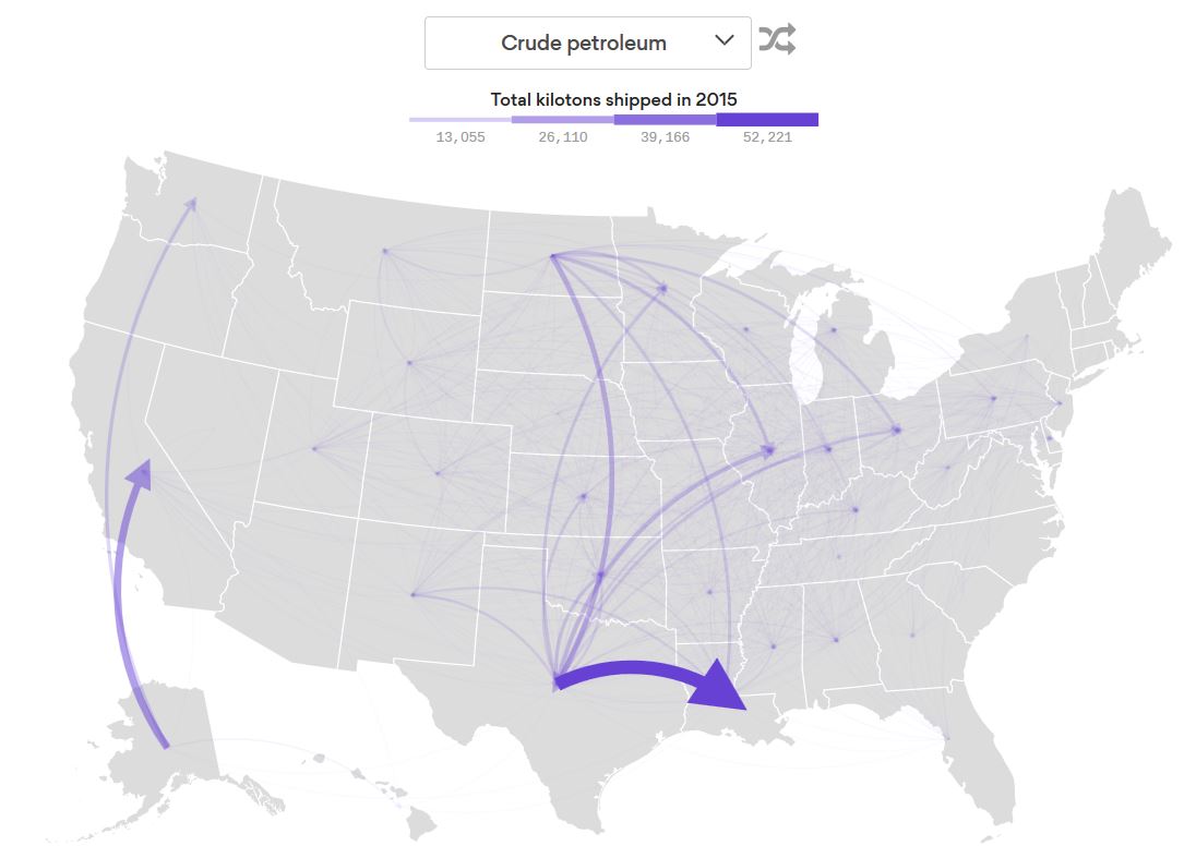
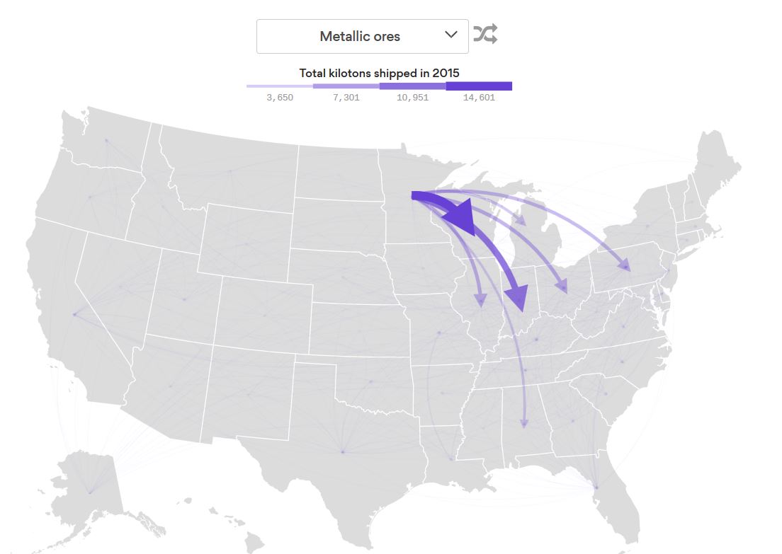
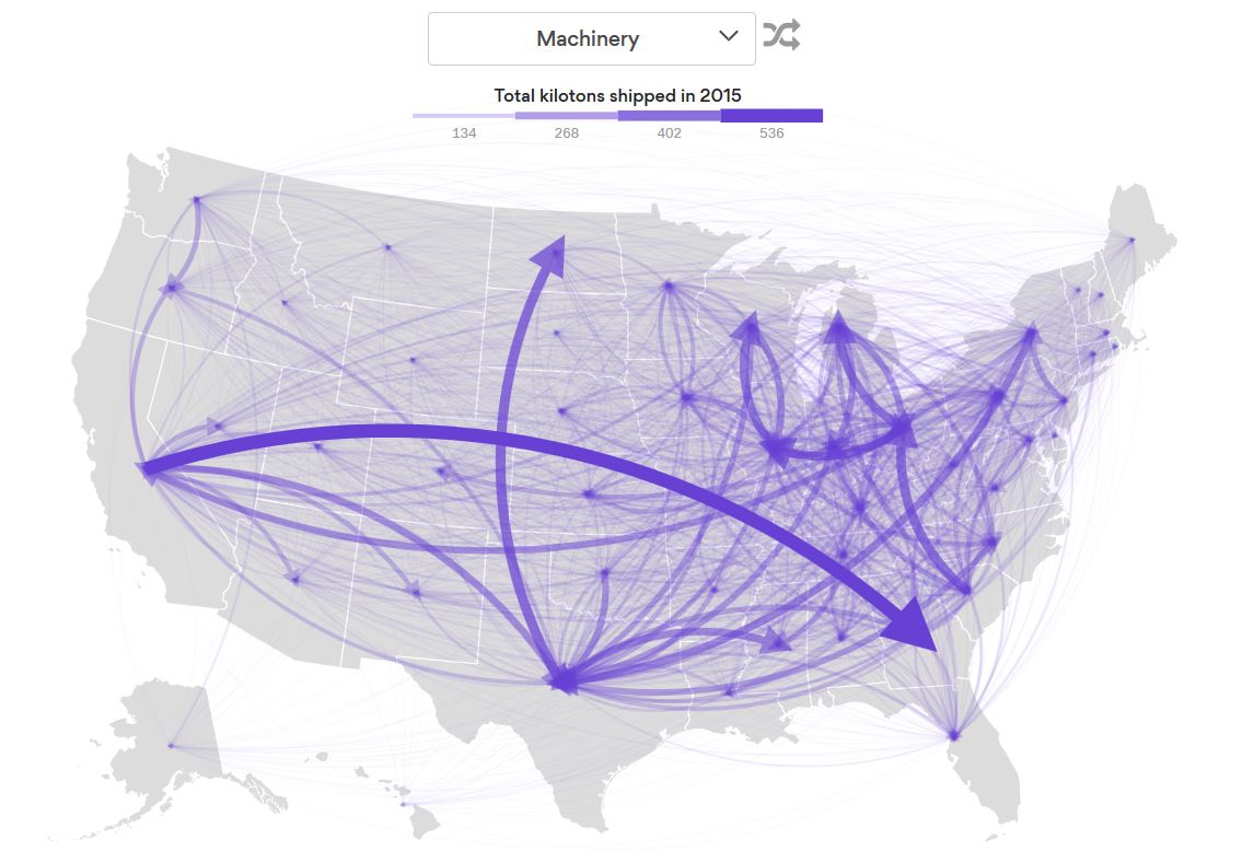
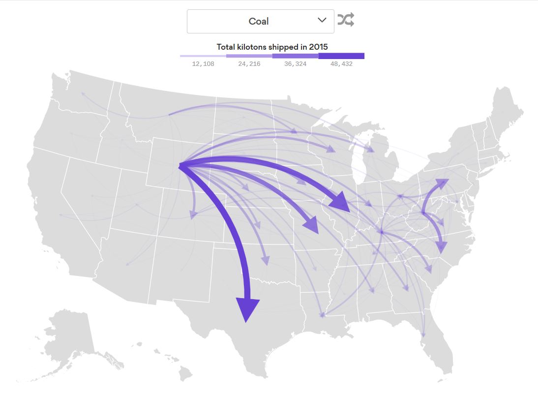
The following map, from Axios, details the flow of all 16 kilotons of domestic freight shipped between the 50 States in 2015. As Axios notes:
“This includes freight moved by trucks, trains, planes and pipelines, but excludes foreign imports and exports and freights transported within a state.
How to read it: The arrows represent the origin and destination of goods shipped between states. Thicker and darker arrows indicate higher volume (each commodity is scaled relative to the highest volume between any two states, so arrow size isn’t comparable across commodities).”
The interactive map cannot be embedded, so to view it click here or click on the map below. Toggle the type of good to see where it is imported and exported within the US.
By selecting different categories of goods and seeing which states are the biggest imports and exporters reveals a few interesting trends:
1.) Wyoming is by far the largest domestic supplier of coal, not Appalachia. Texas is the largest ‘importer’:
2.) Texas and Alaska are the largest ‘exporters’ of crude oil:

3.) Minnesota is the largest ‘exporter’ of metallic ores:

There are many other interesting trends so explore them here.
P.S. If you would like to be updated via email when we post a new article, please click here. It’s free and we won’t send any promotional materials.
Would you like to be notified when we publish a new article on The Sounding Line? Click here to subscribe for free.


