Submitted by Taps Coogan on the 11th of July 2016 to The Sounding Line.
Enjoy The Sounding Line? Click here to subscribe for free.
Nearly all stock indices and composites (the Dow Jones Industrial Average, S&P 500, NASDAQ and NYSE Composites) use a subset of stocks traded on exchanges and/or employ varying market capitalization or share price weighting schemes to determine their index values. The varying stock selections and weighting schemes used by the economists that create these indices and composites are implemented to best represent, pursuant to the priorities of these same economists, the performance of a plurality of companies of differing sizes and importance. In some cases, like the Dow Jones Industrial Average, the underlying companies are changed out regularly.
Indices and composites are undoubtedly useful, but as a result of the selecting and/or weighting/scaling of stocks underlying the indices, their performance is not necessarily representative of the average investor’s experience when participating in the same markets.
One market indicator, which may be more indicative of ‘average’ performance, simply looks at changes in the average transacted share price on an entire stock exchange. The NYSE, the largest US exchange, periodically releases the total number of shares and dollars transacted per day (here). By dividing the total dollars transacted by the number of shares transacted, it is possible to see the average price of a share transacted on a given day. Though this is a macro comparison, it is revealing and important in understanding the actual rather than the index/composite approximated trend of the market.
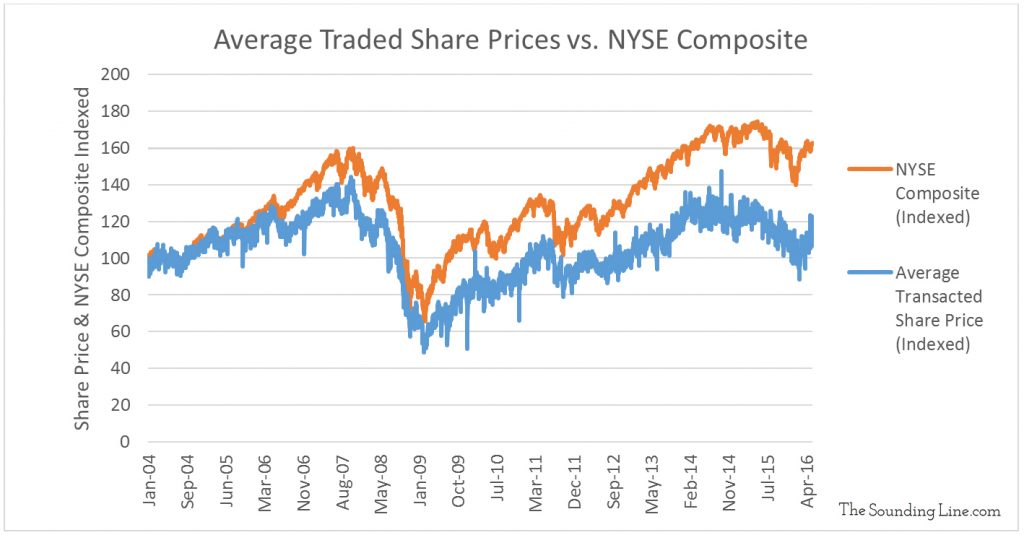
When we chart this metric and compare it to other indicators like the average closing value of the NYSE Composite (a market capitalization weighted composite of all common shares listed on the NYSE) and the average share prices of all companies listed on the NYSE (independent of how many shares are transacted) interesting divergences emerge.
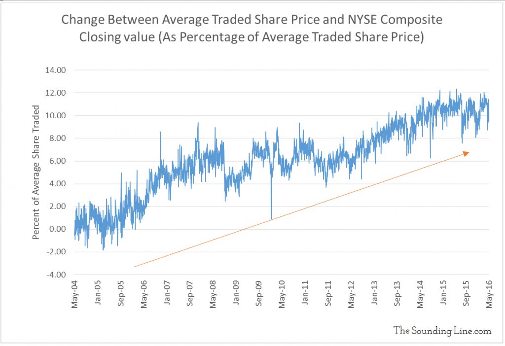
The chart below shows the change in the difference between the NYSE Composite and the average traded prices as a percentage of traded share prices. This illustrates that the difference between the average traded share prices and the NYSE Composite is growing.
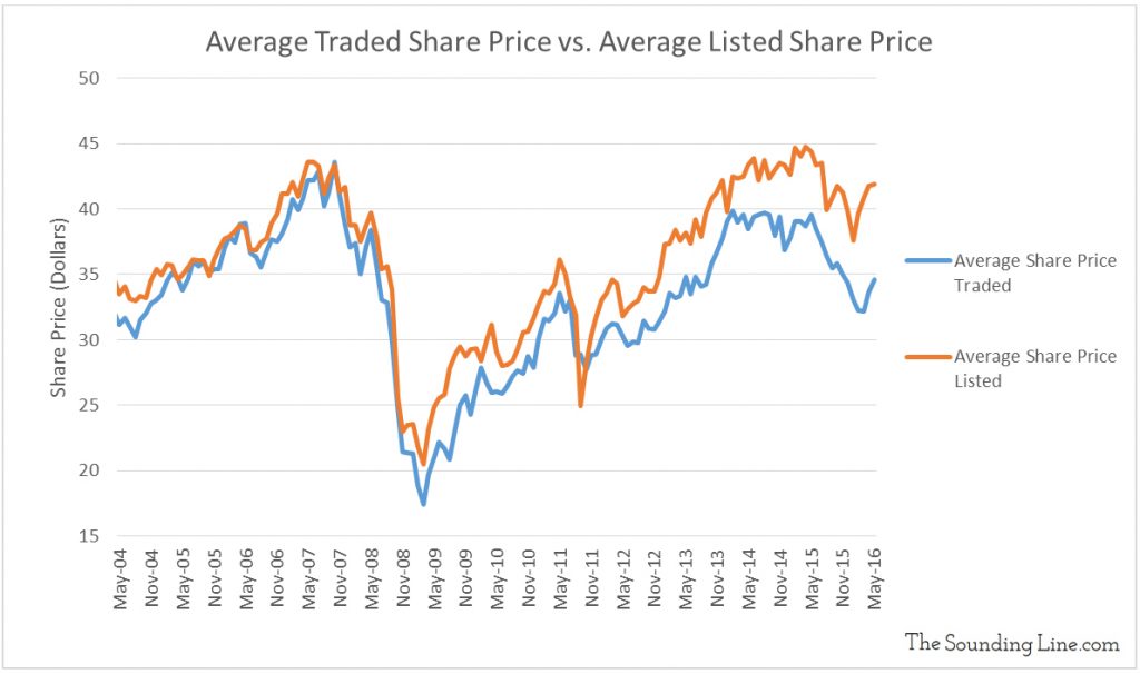
Similarly, the charts below show that the average price of shares listed on the NYSE is increasingly higher than the average price of shares actually being traded.
The difference between the average listed share price and the average traded share price is growing and has become approximately 20% of the average listed price, only exceeded briefly during the 2009 recession!
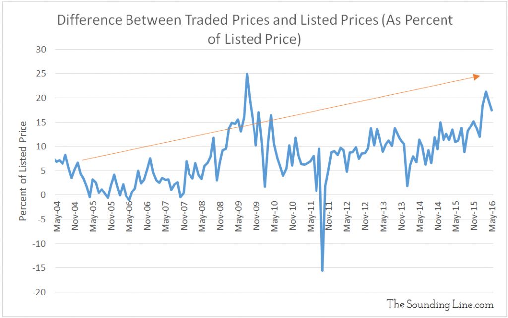
It is not the fact that there are occasional differences between the NYSE Composite, average listed prices, and average traded prices that is important. Instead, it is the fact that there is a steadily growing difference that is critical. From the combination of these two growing divergences any of the following is likely occurring:
- Share prices at the daily close of market are increasingly higher than the prices that the majority of trades are being transacted at throughout the day. In other words, there is a trend that reveals a growing end of the day bias whereby stock prices rise significantly on lower volume at the end of the day. This is important as the bulk of the day’s trading activity was therefore likely concluded at lower prices than the closing prices.
- Because the average price of companies listed on the NYSE is increasingly higher than the average price of shares actually being transacted, we can conclude that higher priced stocks, which are typically also high market capitalization companies, are increasingly unrepresentative of where most of the trading volume is occurring throughout the day. This is important because the indices and composites which use market cap or share price to weight stocks (Dow, S&P 500, NASDAQ & NYSE Composites) must then be increasingly overstating the performance of the broader market by heavily weighting big companies that investors are trading comparatively less and which may be subject to an increased amount of low volume, end of day, price advancement.
- There is increasingly less trading volume for the shares of companies that are advancing as compared to the shares that are declining. Reread this last sentence as it is fundamental to the idea that fewer shares, likely from large market cap companies, likely transacted in the last minutes of the day, are used to calculate the index performance and thus distort the fact that the majority of shares are performing more weakly within the same period.
The astute reader may wonder if initial public offerings (IPO’s), stock splits or other corporate actions could be contributing to this divergence. It is true that the NYSE Composite is adjusted to mitigate the effect of IPO’s and stock splits while the average traded share price, by definition, is not. These events may contribute to the difference between the NYSE Composite and the average traded share price. However, the average listed price is not adjusted for these sorts of events and therefore they cannot explain its divergence from the average traded share price. Therefore, while IPO’s, stock splits, and other corporate actions may contribute to the difference between the NYSE Composite and the average traded share prices, they cannot fully explain the trend of widening difference and certainly not the growing divergence with the average listed share price.
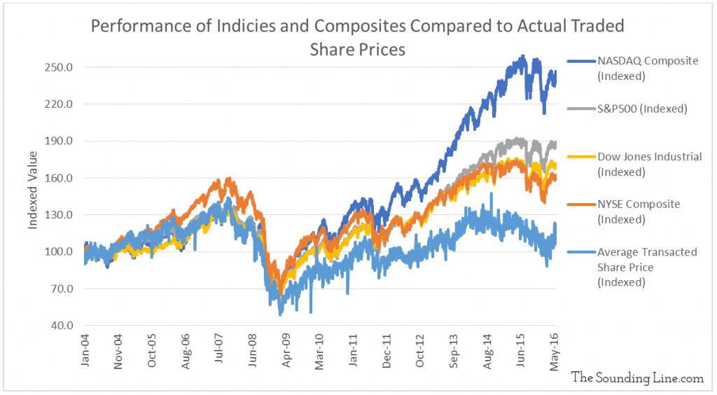
Regardless of their origin, because these discrepancies exist and because they are becoming larger in proportion to share prices, indices and composites are in increasingly unrepresentative of the average market participant’s experiences. After all, if the average share price traded does not go up, then in the overwhelming majority of cases, the average investor is not executing profitable trades. For a sense of the growing magnitude of the problem, look no further than the chart below. The changes in the average share price traded generally matched, and occasionally exceeded, all of the major indices until around 2011. Now they diverge widely.
Which of these do you think is the more accurate representation of the market?
P.S. We have added email distribution for The Sounding Line. If you would like to be updated via email when we post a new article, please click here. It’s free and we won’t send any promotional materials.
Would you like to be notified when we publish a new article on The Sounding Line? Click here to subscribe for free.

