Submitted by Taps Coogan on the 3rd of February 2019 to The Sounding Line.
Enjoy The Sounding Line? Click here to subscribe for free.
Enjoy The Sounding Line? Click here to subscribe.
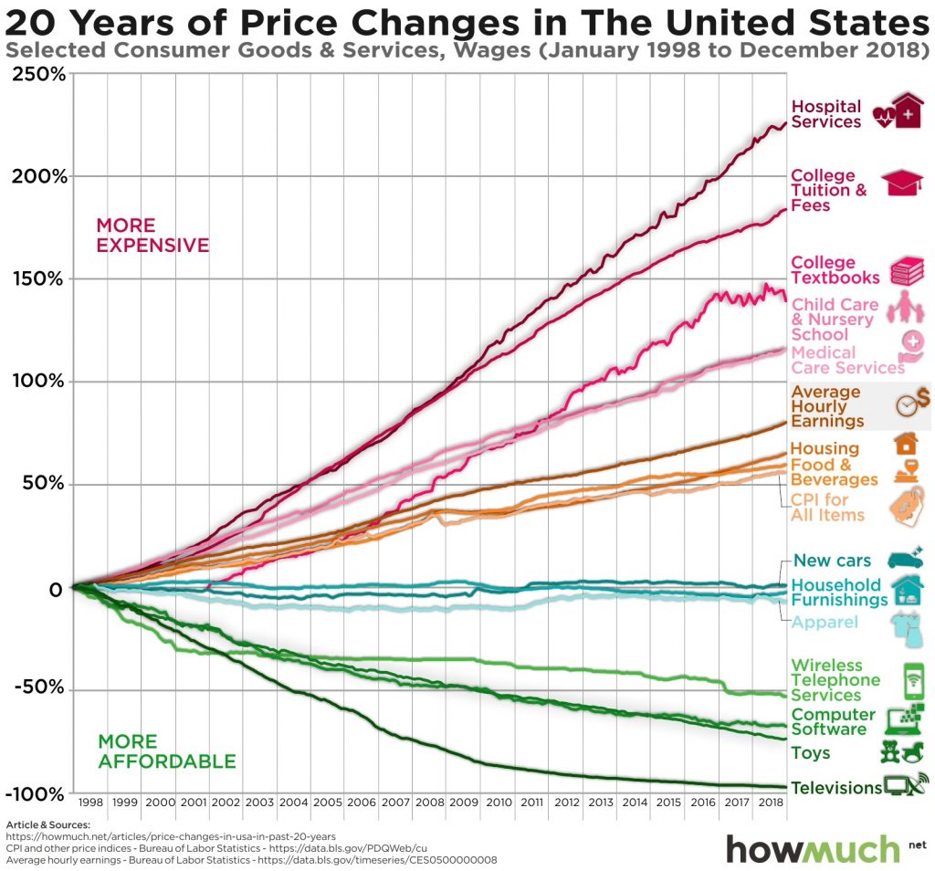
The following chart, from the cost estimation website HowMuch.net, helps visualize a reality that has plagued most Americans for the past couple of decades: real price inflation is much worse than the headline CPI numbers suggest.
Based on CPI data and hourly earnings, the following chart shows the change in affordability of a range of common goods and services since 1998.

Official statistics suggest that the rate of inflation has averaged a subdued 2.15% since 1998. In reality, the average inflation rate masks dramatic cost increases in the purchases Americans have the least discretion over.
Imported consumer goods such as TVs, computers, toys, and phones have gotten significantly more affordable and more feature rich, largely thanks to the offshoring of American manufacturing to wherever labor is cheaper. To a lesser extent the same phenomenon has kept cars, furniture, and clothing costs roughly constant. Meanwhile, the price of anything that can’t be imported from places like China has skyrocketed. Food, housing, medical care, child care, college tuition and textbooks, and hospital stays have all increased more than the core CPI inflation averages. Meanwhile, quality has remained flat at best. In other words, official inflation statistics don’t look bad because they are using cheap consumer goods like toys and TVs to offset large price increases in more expensive and harder to do without things like housing, food, medicine, and education.
With the US now placing tariffs on many of the cheap imports that have kept the CPI numbers so low, one has to wonder how much longer the official headline inflation numbers, and the Federal Reserve, will be able to ignore the true rate of inflation.
If you would like to be updated via email when we post a new article, please click here. It’s free and we won’t send any promotional materials.
Would you like to be notified when we publish a new article on The Sounding Line? Click here to subscribe for free.


Add real estate to this graph and that would lead the pack
That would indeed be interesting
i suggest the first assumption should be: the real inflation equals hourly earnings rise.
simple reason: they would not pay you more unless they are on one hand forced to by the inflation on the other hand they are sure all they pay you is already eaten by the inflation.
more reason: inflation is an AGGREGATE. it is difficult to WEIGH all your expenses, but your income is usually single-source and its weight is 1.
Interesting points but if real inflation was just hourly earnings, people would never lose or gain real purchasing power.
i said first approximation.
over a long enough period of time the inflation will compensate the growth of purchasing power (whereas in local timespans purchasing power peaks are real)
AT LAST,someone who tells it as it is.I’ve known for years that we have been lied to regarding real inflation rates !Just compare this years essential purchases to last years and it stands out like a sore thumb.I saw one report in the past that actually had the audacity to include a reduction in the price of CAVIAR !!Something we all buy on a day to day basis !All the time the purchasing power of our take home pay goes down & down but the truth is kept from us !
While it is politically incorrect (in the truest sense of the phrase) to discuss the TRUE rate of price inflation, which is really just dollar depreciation, I have to take issue with some of the figures implied by the above graph. For example, it is insulting to even suggest that the cost of food in the US has risen only ~60% since 1991! I would say that overall US food price have risen well more than that just since the year 2000, and I would estimate more like 100% since that year. Likewise, it is laughable to suggest that new… Read more »
EDIT: I only realized after posting my comment that I had misread the graph to start in 1991, instead of 1998. But my basic argument, that even the above graph woefully underreports the TRUE rate of price increases in the US over the past 20+ years, still stands.
In the last 30 years, a growing gap has become obvious between government reporting of inflation, as measured by the consumer price index (CPI), and the perceptions of actual inflation held by the general public. The numbers government pumps out today are the result of changes made in the 1990s when political Washington moved to change the nature of the CPI. The cuts in reported inflation were an effort to reduce the federal deficit without anyone in Congress having to do the politically impossible which was to register a vote that would harm the image of Social Security. I further… Read more »