Submitted by Taps Coogan on the 24th of October 2017 to The Sounding Line.
Enjoy The Sounding Line? Click here to subscribe for free.
The Sounding Line reader ‘Vlad’ recently asked:
“Is there any chance you could post an article along with the data sources for the following parameters: the average cost of a home ($) going as far back as possible, average cost of a home per average salary at that time, going as far back in time as possible and the same average cost of a home per price of gold per ounce at that time, going as far back as possible in time.
With these 3 graphs and data sources, your users can judge the change in housing prices not just by the number itself which can be heavily influenced by inflation, but also by the change in purchasing power and lastly by a somewhat more stable reference for value as gold.
It would be really interesting to see when the graphs look alike and at which points they are drastically different.”
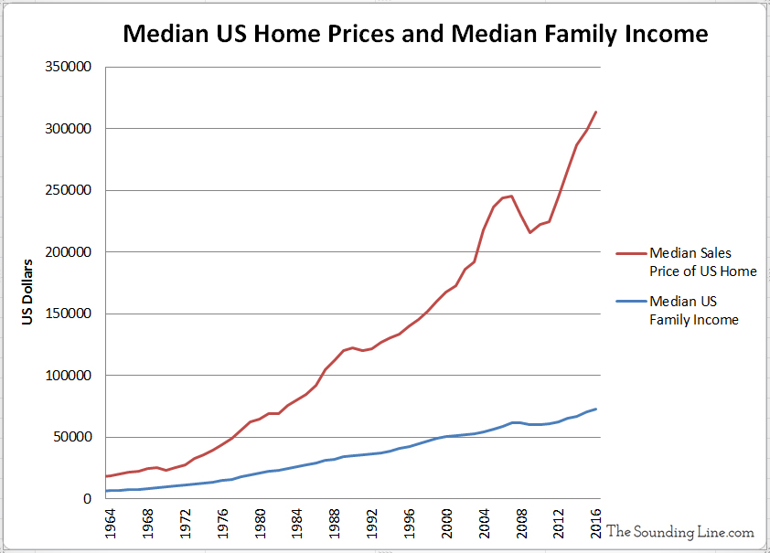
The following three charts show median US house sales prices, median family income, and gold prices (follow the hyperlinks for the sources), as well the as the ratio of median house prices to family income and to gold prices, all since 1963. For an explanation of why I prefer ‘median’ over ‘average’ home prices, and how the two data sets have been diverging, please see ‘Home Prices: Average Not What it Used to Be.’
1.) Median US Home Prices and Median Family Income:
Both median US Home prices and family income have been rising since 1963, though home prices have outpaced income. To me, the feature that stands out the most in this chart is the ‘bump’ in median home prices that started sometime around 2003, the subsequent decline that started around 2007, and then the rapid climb higher in home prices that we have been experiencing since 2011.

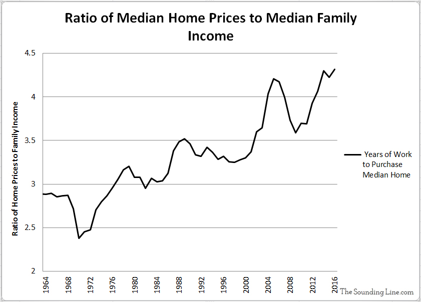
2.) The Ratio Between Median Home Prices and Median Family Income:
We can see from the second chart that a median family home has been getting less and less affordable for the ‘median family.’ Whereas the median family could earn enough to purchase a home in just 2.4 years of work in 1970 (assuming 100% of their income went towards the home), it took the same median family over 4.3 years to buy a home in 2016, nearly twice the time and work. The current level (as of 2016) exceeds the previous all time high of 4.2 years, set in 2005 during the peak of the housing bubble, an ominous sign.

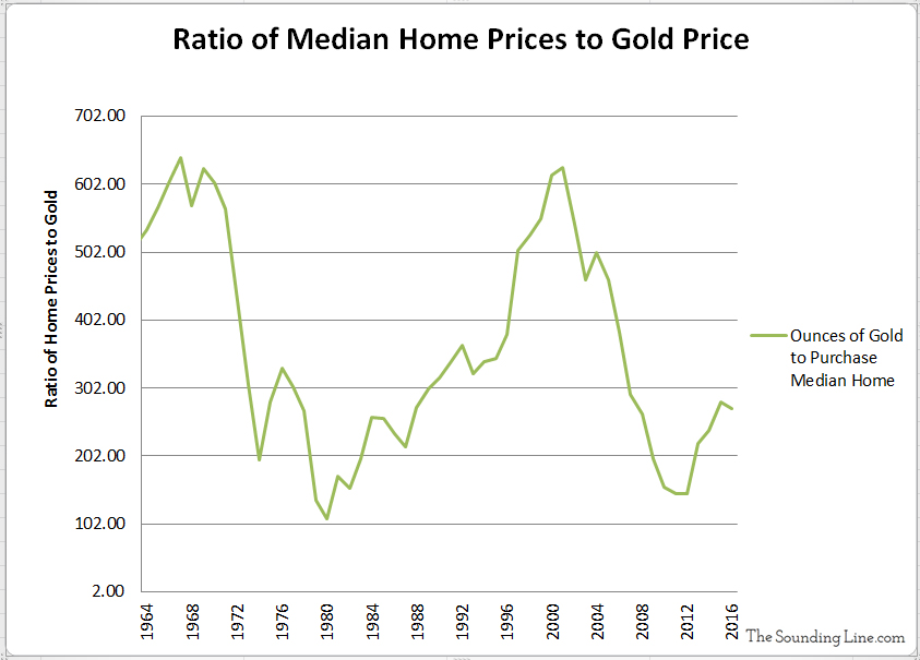
3.) Median Home Prices to Gold
The third chart, perhaps the most interesting, shows the five fold decrease in median home prices relative to gold that followed Nixon’s de facto ending of the Brenton Woods System (1971) and the subsequent dramatic rise in gold prices. Median home prices relative to gold bottomed out by 1982 and then increased steadily until peaking in 2001 at levels nearly identical to those of the late 1960’s. Prices once again declined to lows by 2012, similar to the lows in 1982. Since 2012, homes prices in gold are once again rising, though still quite low.

Taken together, these data sets show that ‘work’ has been an increasingly futile way to finance a home. Meanwhile, median home prices are actually 2.3 times lower today than they were in 1970, if paid for in gold. One can also see that the current expansion in home prices has outstripped income in a way reminiscent of the 2007 housing bubble.
Thanks to Vlad for the well considered and interesting suggestion. I hope this answers your question. What are your impressions?
P.S. We recently added email distribution for The Sounding Line. If anyone would like to be updated via email when we post a new article, you should find the subscription box at the bottom of the ‘Top News Stories’ Column on the left hand side of the website or here. It’s free and we won’t send any promotional materials.
Would you like to be notified when we publish a new article on The Sounding Line? Click here to subscribe for free.


Interesting, insightful article. You need more exposure.
Great article
Thank you
Wouldn’t it be more accurate to compare the cost of comparable square footage homes? The average size home today is over 100% larger than 1960.
That would also be very interesting, yes.
Here you go:
https://thesoundingline.com/the-typical-american-house-has-grown-much-faster-than-the-typical-american-income/
Homes sold today are a lot different than those of decades ago. How can you control for that change to do a proper comparison of buying power and the comparison between cost and incomes?
Not exactly what you are looking for but along those lines:
https://thesoundingline.com/the-typical-american-house-has-grown-much-faster-than-the-typical-american-income/
Median Salary. Not Median household income. Household would be husband and wive. Which is way higher.
Actually, it is median household income, follow the links in the article