Submitted by Taps Coogan on the 15th of February 2016 to The Sounding Line.
Enjoy The Sounding Line? Click here to subscribe for free.
Rick Santelli and Jim Bianco’s interview on CNBC last week was a fruitful one. In ‘The Wealth Effect – a Primer – Rick Santelli and Jim Bianco’ (link here) we highlighted their discussion about the wealth effect.
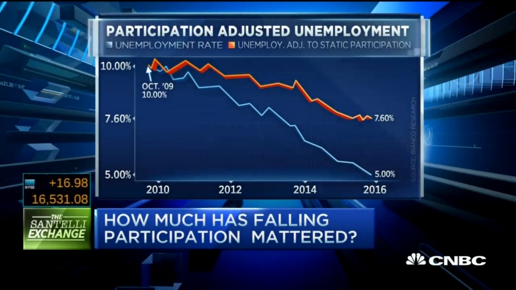
Another portion of the interview can be found at the end of this article. Jim Bianco and Rick Santelli present the following chart, which illustrates the unemployment rate adjusted for change in the participation rate of the labor force. Jim Bianco notes that if one accounts for the changes in the labor force, the unemployment rate is actually 7.6% as opposed to the 4.9% figure currently provided by the Bureau of Labor Statistics (BLS.)
Let’s take a close look at how such a discrepancy can exist in regard to the U.S. employment numbers.
We would hope that the following would hold true when trying to determine the Unemployment Rate:
- Every able bodied person that is of working age and could be employed would be counted as “employed” or “unemployed”
- That there would be a clear delineation between Full Time employment (40 hours a week) and Part Time employment (<40 hours a week)
- That statistical tools that do not rely on actual employers counting actually employed people would be held to an absolute minimum
Unfortunately, that is not the case. Currently the BLS defines the unemployment rate as the percentage of people in the labor force who are unemployed as opposed to simply the percentage of working age people that have jobs. To be in the labor force, you need to have a full or part time job or be actively applying for jobs and immediately available for work. Remarkably, if someone stops actively looking for work or is not immediately available for work, barring extenuating circumstances, they are not counted as part of the labor force. All other things being constant, the unemployment rate can improve without a single job being created if unemployed people stop looking for work.
The chart below shows that the unemployment rate in the United States has improved greatly since the 2008 financial crisis. The BLS currently says only 4.9% of the “actively looking” workforce is unemployed, a fact that has been paraded as proof that the U.S. labor market has been made a full recovery since 2008.
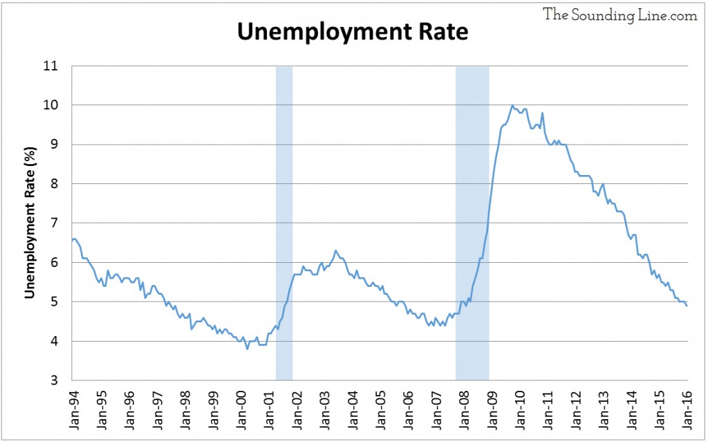
Despite the great looking unemployment graph above, a key question arises. How much of the improvement in the unemployment rate is due to job creation and how much is due to people leaving the work force? Jim Bianco’s and Rick Santelli offered an answer to that question by saying that only about half of the improvement in unemployment was due to new jobs. The other half was due to people leaving the labor force. That’s a great invitation to take a deeper look at labor statistics and create a historical perspective in order to answer the following question:
What is the health of the U.S. labor markets?
In order to answer the question, some definitions are provided with the quotations attributable to the BLS (additional info available here):
- Labor Force: “This measure is the sum of the employed and the unemployed. In other words, the labor force level is the number of people who are either working or actively seeking work.”
- The ‘employed’ includes anyone who works during the course of the week, full time or part time, for pay or as part of a family business.
- The ‘activity seeking work’ are the ‘unemployed’ and are basically those who have applied for a job within the last 4 weeks and are currently available to work.
- Unemployment Rate: “…this statistic reflects the number of unemployed people as a percentage of the labor force”
- The Labor Force Participation Rate: “This measure is the number of people in the labor force as a percentage of the civilian non-institutional population 16 years old and over.”
- In other words, it is the percentage of the population that is either working or actively seeking work.
- The Employment Population Ratio: “This measure is the number of employed as a percentage of the civilian non-institutional population 16 years old and over.”
- In other words, it is the percentage of the population that is currently working.
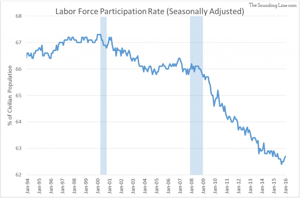
The claim that the U.S. labor market has improved has been countered by indicators like the Labor Force Participation Rate shown in the chart below. This indicator shows that the labor force (employed and unemployed) has gotten rapidly smaller as a percentage of the civilian population and never recovered since the 2008 crisis.
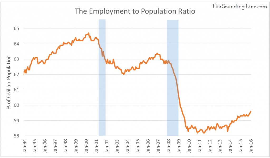
The labor Employment to Population Ratio, which is the ratio of employed people to the civilian population, is shown below. The ratio of employed people collapsed after the 2008 financial crisis, falling by about 4.5% and has only recovered 1.1% of the drop.
The chart below sums up the divergence between the unemployment rate and the Employment to Population Ratio.
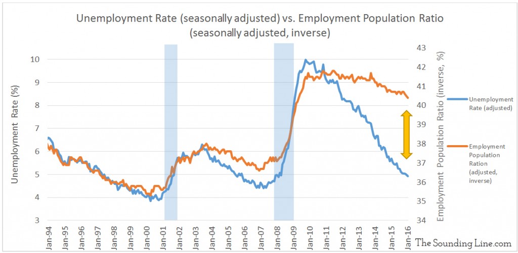
The percent of the population that is working has not come close to recovering since the 2008 financial crisis. However, the percentage of people actively seeking work, who have found work, has fully recovered. What explains this divergence? The difference is simply people leaving, or never entering, the labor force.
Doing a bit of algebra we can determine how much of the improvement in the unemployment rate came from job creation and how much came from people giving up work.
- The unemployment rate peaked at 10% in October 2009.
- Since then 2.6% of the working age civilian population left the labor force
- Since then 1.1% of the working age civilian population found jobs.
That means that since the depths of the financial crisis, accounting for the growing population, for every person that found a job, two to three people gave up on the labor market altogether. Put another way, about two-thirds of the recovery in unemployment is due to people giving up on the labor market
At this point, some people will point out that the aging baby boomer generation is starting to leave the labor force and that many of those leaving the labor force are simply retiring. This is unquestionably true. To a degree, the average age in the U.S. is increasing and thus a larger portion of the population will inevitably be retired. However, three points must be made.
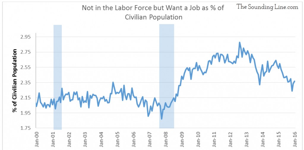
First, the number of people who are not in the labor force but who want a job, has increased since the recession.
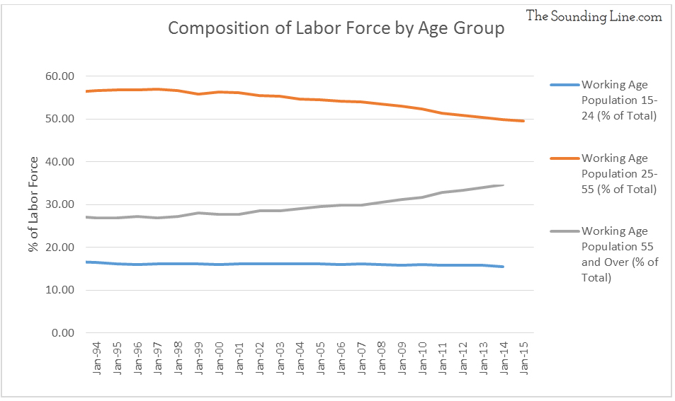
Second, the aging population theory cannot explain why the labor participation rate among 16-19, 20-24, and 25-54 year olds is declining. In fact, the 55 and older age group is the only age group where labor participation has increased since 1994 and has now surpassed the rate for 16-19 year olds.

The astute reader will appreciate that while the labor participation rate for those over 55 is increasing, it is still lower than the overall rate. So, if more people are entering the 55+ age group than the others, it is still possible that some, but not all, of the decrease in labor participation is due to the aging population. As shown in the chart below, indeed the population over 55 has grown faster than the younger age groups.
To recap, we have established that the since the financial crisis, the unemployment rate has recovered yet the percent of the working age population that is working has not. We saw that the unemployment rate has improved mostly due to people leaving the workforce and that labor participation has been decreasing amongst people under 55.
One question remains:
How many people left the labor force because they grew older and how many left for other reasons?
Time for a bit more algebra:
From January 2009 to January 2014, the number of people over 55 increased by 12.6 million. Those people went from the 25-54 age group to the 55 and over group and therefore they went from having an average participation in 2009 of 82.8% to 40.0%. The over 55 labor participation rate stayed constant around 40% thereafter. Thus it can be assumed that roughly 5.4 million people left the work force simply because they aged. However, during the same period the population of people under 55 grew by 331,000 yet the labor force under 55 shrunk by nearly 4 million people. Therefore, a total of 4.3 million people under 55 left, or never joined, the work force.
5.4 million people ‘retired’ and 4.3 million people under 55 left, or never joined, the labor force. Put another way, nearly half of the decline in the labor force has nothing to do with age.
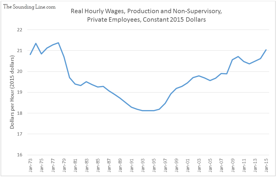
As shown below, with real hourly wages lower than in 1975, for many, perhaps it’s just not worth it to work.
Would you like to be notified when we publish a new article on The Sounding Line? Click here to subscribe for free.


[…] the unemployment rate since 2008 is due to people leaving the labor force, not getting jobs (link here). The percentage of working age people with jobs is far lower than before the 2008 […]
[…] prospects. As we discussed in ‘The Unemployment Rate – Pulling back the Curtain’ (link here), proportionality fewer people, particularly younger people, are in the labor force and wages have […]
[…] of an improving U.S. economy. While matched in more than equal part by serious skepticism (read here), a much more fundamental question needs to be addressed when using the unemployment rate to […]
[…] since 2008, simultaneously with a weakening global economy, deteriorating labor participation (here), falling U.S. industrial production (here), falling home prices (here), and falling commodity […]
[…] to the contrary, labor markets have not recovered from the 2008 recession. As described in detail here, the percentage of people in the labor force continues to decline and, critically, the percentage […]