Submitted by Taps Coogan on the 23rd of February 2016 to The Sounding Line.
Enjoy The Sounding Line? Click here to subscribe for free.
Imagine a thriving economy. Ever more people are getting better paying jobs, consumers are spending, banks are lending, and businesses are investing in new capacity and products. In this economy, money would be flowing quickly between labor, consumers, banks, and industry.
Now imagine a weakening economy. Proportionally fewer people are working, wages are stagnant, consumers can’t afford to spend, banks are lending less, and businesses are not investing in new capacity and products. In a weak economy like this, money moves slowly as consumers, banks, and companies spend less.
As these examples illustrate, the rate at which money changes hands in the economy is a useful indication of whether real economic activity is increasing. The rate at which money changes hands is called the velocity of money and it is tracked by the Federal Reserve as an important indicator of economic activity.
The St. Louis Fed provides a great definition of the velocity of money and the types of money they monitor (link here):
“The velocity of money is the frequency at which one unit of currency is used to purchase domestically- produced goods and services within a given time period. In other words, it is the number of times one dollar is spent to buy goods and services per unit of time. If the velocity of money is increasing, then more transactions are occurring between individuals in an economy.
The frequency of currency exchange can be used to determine the velocity of a given component of the money supply, providing some insight into whether consumers and businesses are saving or spending their money. There are several components of the money supply: M1, M2, and MZM (M3 is no longer tracked by the Federal Reserve); these components are arranged on a spectrum of narrowest to broadest. Consider M1, the narrowest component. M1 is the money supply of currency in circulation (notes and coins, traveler’s checks [non-bank issuers], demand deposits, and checkable deposits). A decreasing velocity of M1 might indicate fewer short- term consumption transactions are taking place. We can think of shorter- term transactions as consumption we might make on an everyday basis.
The broader M2 component includes M1 in addition to saving deposits, certificates of deposit (less than $100,000), and money market deposits for individuals. Comparing the velocities of M1 and M2 provides some insight into how quickly the economy is spending and how quickly it is saving.
MZM (money with zero maturity) is the broadest component and consists of the supply of financial assets redeemable at par on demand: notes and coins in circulation, traveler’s checks (non-bank issuers), demand deposits, other checkable deposits, savings deposits, and all money market funds. The velocity of MZM helps determine how often financial assets are switching hands within the economy.”
Given that explanation, we ask the following question:
What is the velocity of money telling us about the U.S. economic recovery since the 2008 financial crisis?
By looking at M1 velocity, we can see the health of short term everyday consumer spending.
Alarmingly, the chart below shows that the velocity of M1 has relentlessly deteriorated since the 2008 financial crisis.
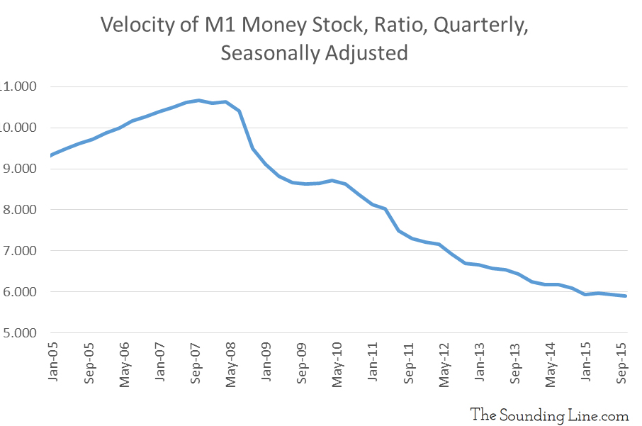
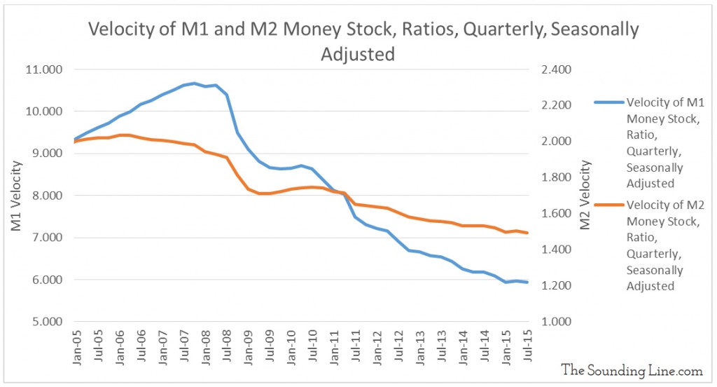
M1 velocity peaked in October 2007. Since then, it has decreased by approximately 45%. Over the same period M2 velocity decreased by approximately 26%. The fact that M1 velocity is declining faster than M2 velocity likely means that consumers’ spending is weakening faster than their savings. This may be a reaction by consumers to their increasingly uncertain economic prospects. As we discussed in ‘The Unemployment Rate – Pulling back the Curtain’ (link here), proportionally fewer people, particularly younger people, are in the labor force and wages have been stagnant.
By looking at the velocity of MZM, we can see the velocity at which financial assets are being traded. The deteriorating trend shown in the chart below is similarly concerning.
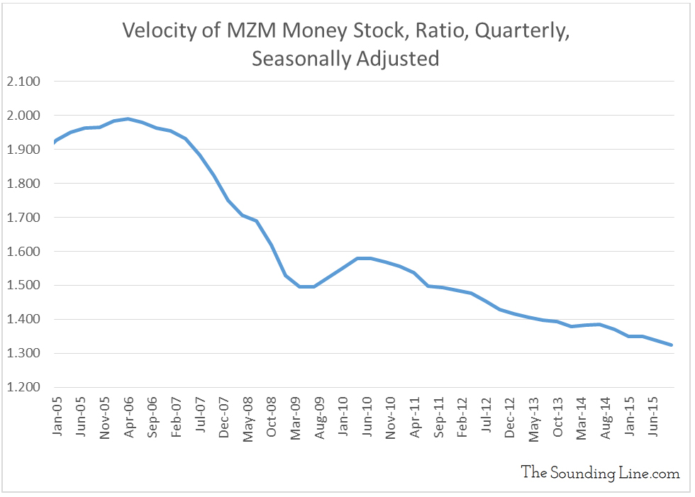
The velocity of M1, M2, and MZM money have all been declining unrelentingly since the 2008 financial crisis. This adds greatly to the skepticism that record stock prices produced by the Fed’s Zero Interest Rate Policy (ZIRP) and Quantitative Easing (QE) programs ever translated into substantive economic improvement. More likely, profits made by comparatively few people in the stock market, at the expense of fixed income and bank interest for the comparatively many, has led to the largest division in wealth in U.S. history, not fundamental economic improvement. One would imagine that if you are a financial institution at the receiving end of this equation, it would be hard to see the truth for what it is.
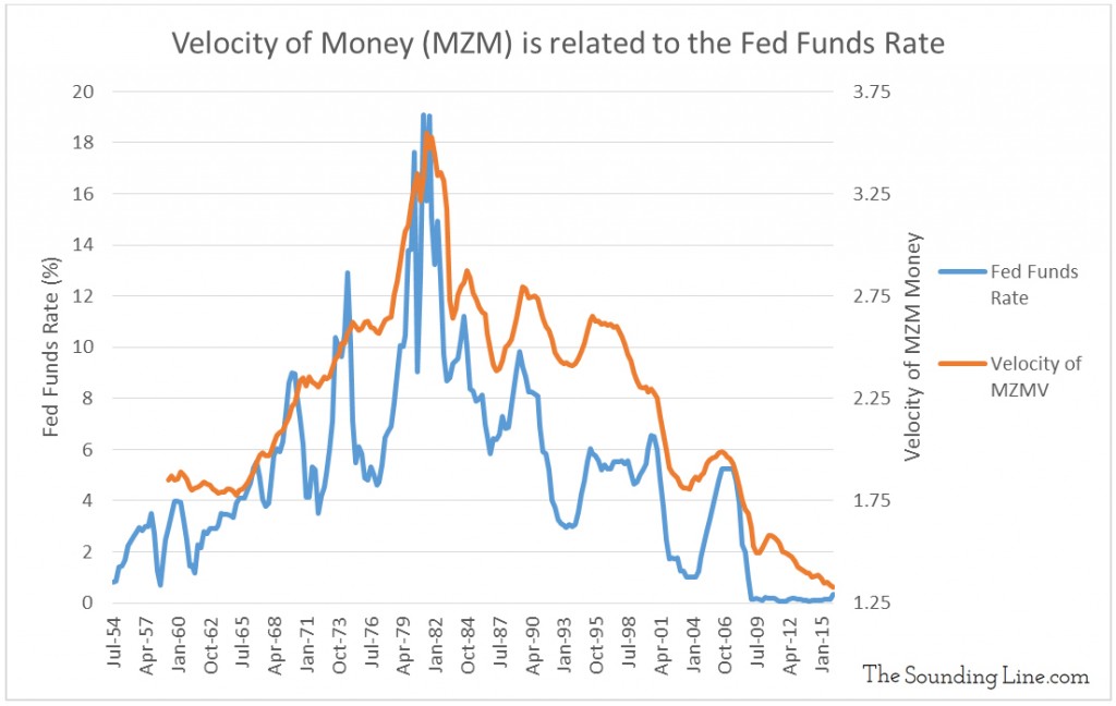
As the following chart shows, it is no coincidence that the Fed’s lower interest rates have slowed the velocity of money. In fact, the Fed funds rate and the velocity of MZM money are strongly correlated. Based on the definition of MZM velocity (Nominal GDP divided by MZM Money Supply) this would indicate that falling interest rates occur when financial asset creation expands faster than the growth of the economy (what is happening now). It is during periods of rising interest rates that the economy (as measured by GPD) expands faster than the supply financial instruments.
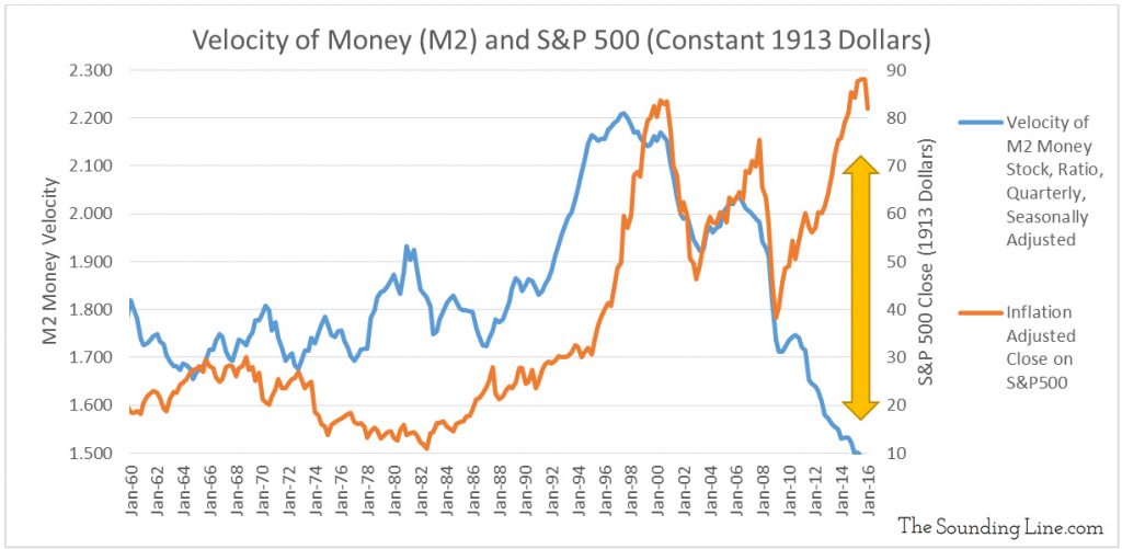
Of more acute interest, there has historically been a correlation between M2 velocity and stock indices. Intuitively this makes sense as increasing consumer activity and savings leads to a healthier economy and higher stock prices. In fact, the declining velocity of M2 was a good leading indicator that the end was coming for the 2001 tech bubble and the 2008 housing bubble. That’s why the chart below is very concerning. The current divergence between the velocity of M2 money and stock indices is unprecedented.
Given these very concerning charts, we are interested to know what the Fed thinks about the developments in the velocity of money. Fortunately, they have attempted to address these very questions (link here). From the St. Louis Fed:
“During the first and second quarters of 2014, the velocity of the monetary base2 was at 4.4, its slowest pace on record. This means that every dollar in the monetary base was spent only 4.4 times in the economy during the past year, down from 17.2 just prior to the recession. This implies that the unprecedented monetary base increase driven by the Fed’s large money injections through its large-scale asset purchase programs has failed to cause at least a one-for-one proportional increase in nominal GDP. Thus, it is precisely the sharp decline in velocity that has offset the sharp increase in money supply, leading to the almost no change in nominal GDP
So why did the monetary base increase not cause a proportionate increase in either the general price level or GDP? The answer lies in the private sector’s dramatic increase in their willingness to hoard money instead of spend it. Such an unprecedented increase in money demand has slowed down the velocity of money, as the figure below shows.”
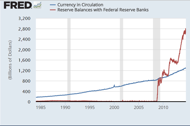
What did they just say…? According to the Fed, the failure of their own policies to produce nominal GDP growth, despite printing $3.5 trillion and artificially suppressing interest rates for nearly a decade, has nothing to do with the appropriateness or efficacy of said policy, but is instead a result of unprecedented “hoarding” by the ‘private sector’. To provide evidence of this they show a graph of the explosion in reserve balances with Federal Reserve Member Banks. Surely the St. Louis Fed knows that falling interest rates have been correlated to a declining velocity of money since records began in the 1950s.
Perhaps the St. Louis Fed should speak more with the San Francisco Fed. While the St. Louis Fed is clearly blaming the failure of the Fed policies to produce meaningful economic growth on private ‘hoarders’, the San Francisco Fed very correctly described here that it is the Fed’s own interest on reserves rate policy (IORR) implemented in 2008 that led to the ‘hoarding’ of money, not by private individuals, but by the Fed member banks themselves, at the Fed.
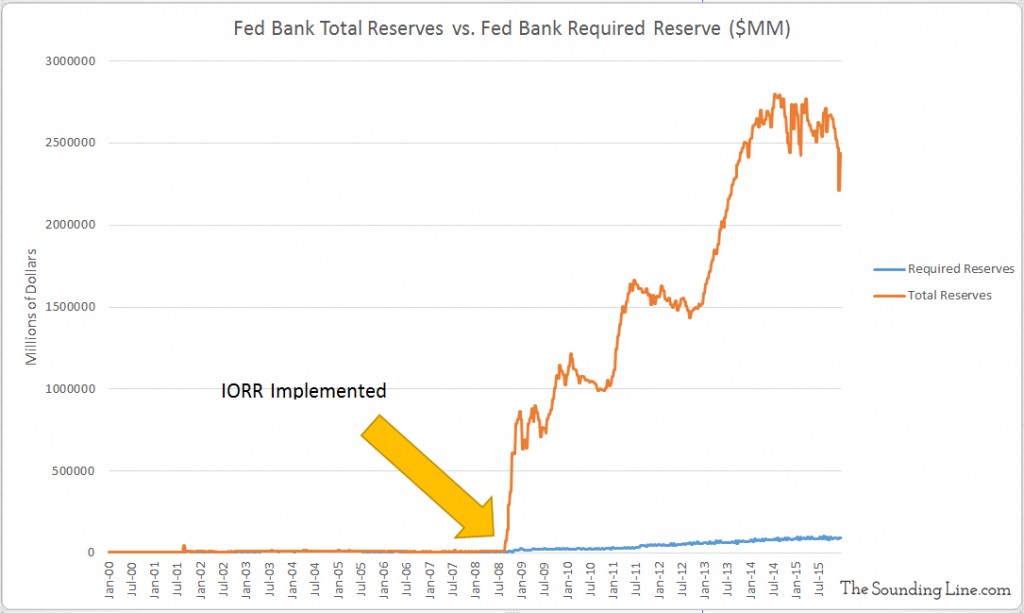
“Once the Fed was authorized to pay interest on reserves, the relationship between the levels of required reserves and excess reserves changed dramatically. For example, required reserves averaged almost $100 billion during the first six months of 2012, while excess reserves averaged $1.5 trillion!… the Fed can change the rate for interest on reserves to adjust the incentives for depository institutions to hold reserves to a level that is appropriate for monetary policy”
In other words, and as shown in the chart below, the timing of the explosion in excess reserves lines up perfectly with the implementation of the IORR policy. The Fed implemented a policy of paying Fed member banks interest on their reserves, and not surprisingly, the banks kept far more reserves than required. ‘Private hoarding’ simply has nothing to do with it. It was the Fed banks that hoarded money, at the Fed, to take advantage of IORR interest payments from the Fed, as discussed in depth here.
Regardless of whom the Fed wants to blame for the failure of its policies to “produce a change in nominal GDP”, even according to the Fed themselves, the velocity of money is telling a very concerning tale about the U.S. economic ‘recovery’.
Would you like to be notified when we publish a new article on The Sounding Line? Click here to subscribe for free.


[…] ‘The Velocity of Money – A Cautionary Tale’ (link here), we looked at the velocity of money as an important indication of the health of the U.S. economy. […]