Submitted by Taps Coogan on the 12th of December 2019 to The Sounding Line.
Enjoy The Sounding Line? Click here to subscribe for free.
Enjoy The Sounding Line? Click here to subscribe.
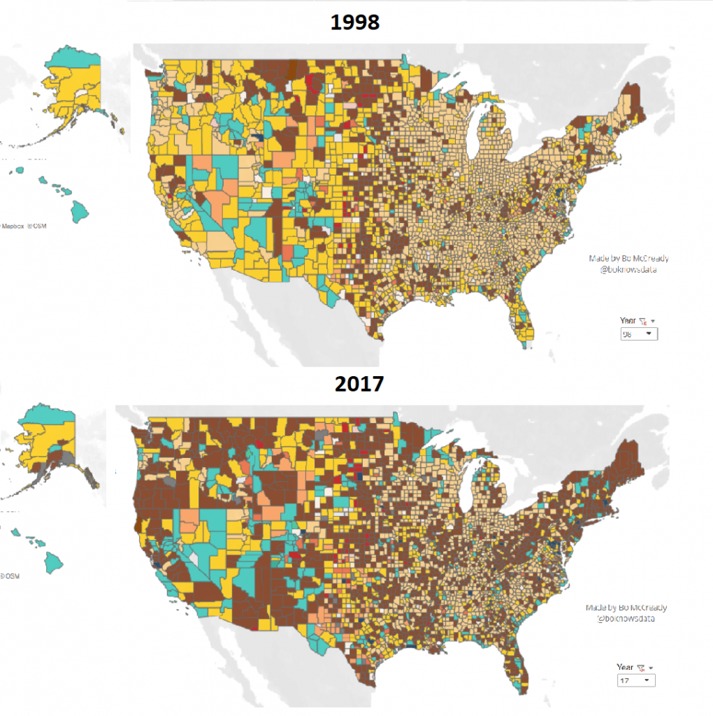
The following maps and charts, from data visualizer Bo McCready, show the evolution of the US work force from 1998 to 2017, based on data from County Business Patterns surveys. For an interactive version of the graphics, skip to the end.
From Manufacturing to Healthcare and Social Services
As Bo McCready notes, the US has seen its labor force go from mostly manufacturing jobs and less than 20% healthcare and social assistance in 1998 to the nearly the exact opposite today: roughly 50% healthcare and social assistance with less than 20% manufacturing jobs. In Maine, the nation’s most elderly state, healthcare and social assistance jobs now comprise the most common occupation in every single county except one (Sagadahoc county). The same is true of Connecticut.


Interactive version. For better viewing, click to expand it at the bottom right (slide right)
Would you like to be notified when we publish a new article on The Sounding Line? Click here to subscribe for free.
Would you like to be notified when we publish a new article on The Sounding Line? Click here to subscribe for free.

