Submitted by Taps Coogan on the 19th of October 2018 to The Sounding Line.
Enjoy The Sounding Line? Click here to subscribe for free.
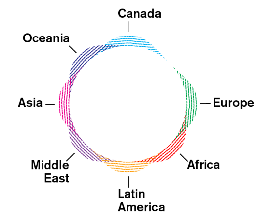
The following video and images, from Northeastern University, take a novel approach to visualizing immigration to the US. Using data on all legal immigration to the US since 1830, a ‘tree-ring’ is created for every decade with the color and directionality of the ring denoting the sources of immigration and the size of the ring indicating the number of people who immigrated into the US:
“Cells grow more in specific directions depending on the geographic origin of the immigrants. Rings that are more skewed toward the country’s East, for example, show more immigration from Europe, while rings skewed South show more immigration from Latin America.“
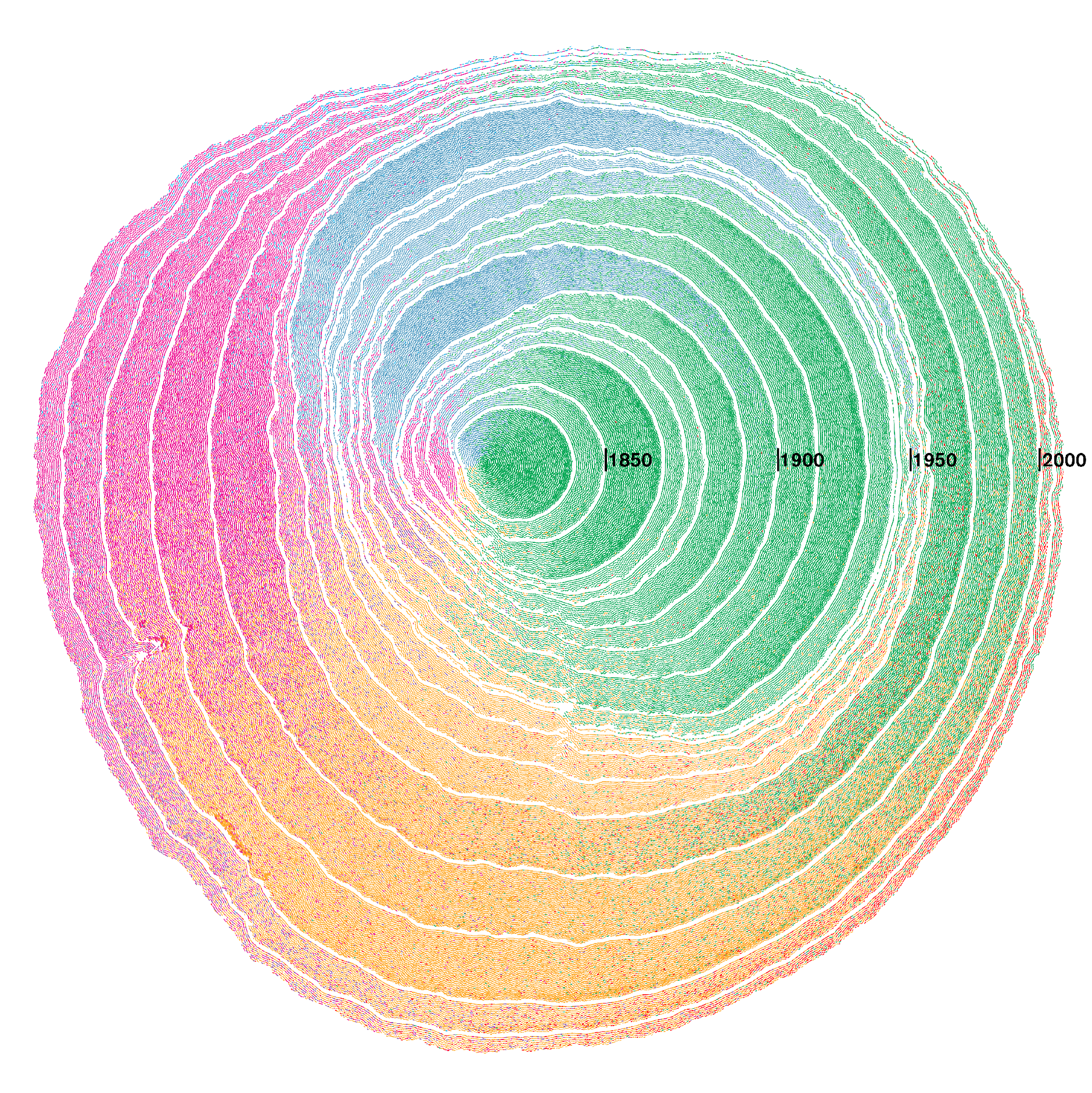
Each dot in a ring represents 100 immigrants. Watch how the sources of immigration to the US have changed over the decades from mostly European, to mostly Canadian, then mostly Asian and Latin American, and most recently to increasingly African:
The final product is the ‘tree’ of immigration to the US since 1830:
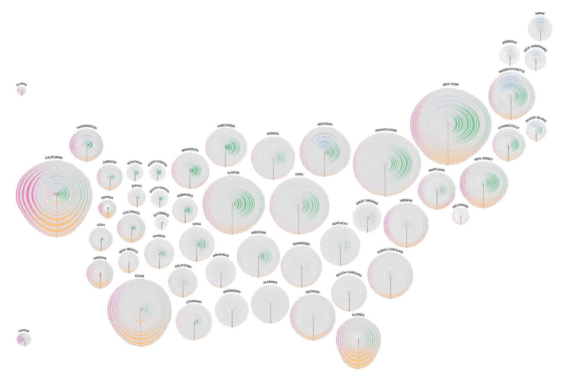
By including natural born US citizens, colored as grey, the following map shows the composition of the entire legal resident population of every state in the US. One can easily see the large differences in the proportions and origins of the immigrant populations around the US. States like South Carolina or Tennessee are nearly entirely native born, whereas California and New York have large immigration populations, though originating from different parts of the world.
To see another visualization of immigration to the US by country, read this.
If you would like to be updated via email when we post a new article, please click here. It’s free and we won’t send any spam.
Would you like to be notified when we publish a new article on The Sounding Line? Click here to subscribe for free.


