Submitted by Taps Coogan on the 27th of July 2018 to The Sounding Line.
Enjoy The Sounding Line? Click here to subscribe for free.
Providing more granularity than our previous post ‘The Unemployment Rate in Every State in the US,’ the following interactive map shows the unemployment rate in every county in the US, based on the most recent BLS data from 2017.
(Zoom out to see data for Alaska, Hawaii, and Puerto Rico)
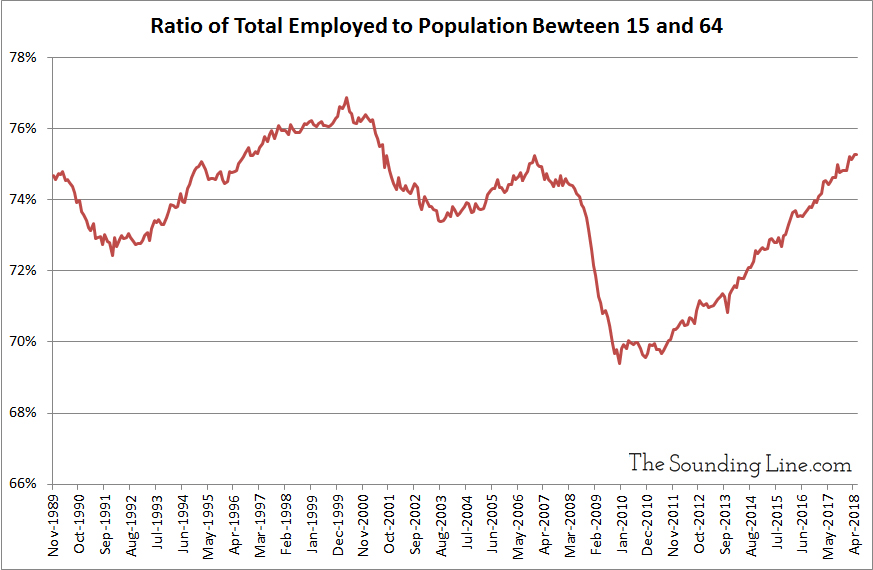
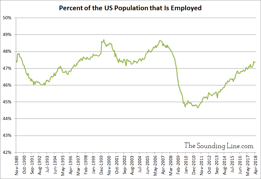
While the overall US unemployment rate is reaching its lowest levels since the late 1960s (3.9%), and both the labor force participation rate and the ratio of workers to population is finally recovering to pre-recession levels (see charts below), many regions of the US are still struggling with high unemployment rates indicative of economic hardship. In particular, many counties is West Virginia, New Mexico, Arizona, Louisiana, Mississippi, Alaska, Northern Michigan, California, upstate New York, and Puerto Rico have unemployment rates near or in excess of 7.5%. Some are in excess of 15%. In fact, about 46% of unemployed Americans who are actively seeking work live in counties where the unemployment rate is at least 7.5%, even though only 6.8% of US counties have unemployment rates that high and only 2% of the total labor force lives in those counties. All of this points to wide divergences between communities where the economy is strong and those where it is not.
There is a large geographic mismatch between the people who need jobs and the communities that have them, a fact which is a significant contributor to systemic unemployment and the inability of companies to find sufficient labor.
P.S. If you would like to be updated via email when we post a new article, please click here. It’s free and we won’t send any promotional materials.


Would you like to be notified when we publish a new article on The Sounding Line? Click here to subscribe for free.

