Submitted by Taps Coogan on the 10th of April 2018 to The Sounding Line.
Enjoy The Sounding Line? Click here to subscribe for free.
The following interactive map, from the Metrocosm, shows the flow of airline traffic to and from every major airport and country in the world. As Metrocosm’s Max Galka notes:
“This globe displays one year of global air passenger traffic. The data comes from modeled estimates compiled for the Vector-borne Disease Airport Importation Risk project (available for download at WorldPop). In 2010, the year for which the data was modeled, there were roughly 30 million commercial flights around the world carrying about 2.8 billion passengers.”
“In the graphic, the air passenger flows are visualized as 1.4 million particles — each one representing 2,000 passengers. Airports are shown as purple spheres, with their size denoting total passenger traffic over the year.”
“The busiest routes are not in the U.S. or Europe as you might expect. In fact, no U.S. flight route, those departing from or arriving at any U.S. airport, even cracks the top 100. Denver International to Hartsfield-Jackson Atlanta International, America’s most trafficked route, ranks only #101 worldwide.”
“The busiest flight route involving a European airport, New York JFK to London Heathrow, doesn’t appear until number 224!”
Clicking on a specific country reveals that country’s airline traffic.
(Click here for a full screen version)
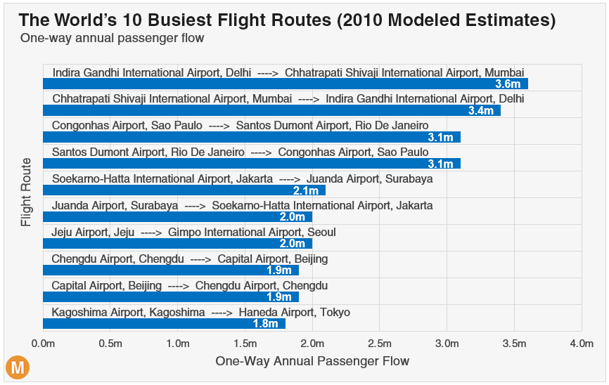
Here are the top ten busiest routes:
It should not come as a surprise that the top ten busiest routes are dominated by fast growing emerging economies with increasingly wealthy populations. Keep in mind that some of the trends are likely to have changed since the data set was compiled (2010).
P.S. If you would like to be updated via email when we post a new article, please click here. It’s free and we won’t send any promotional materials.
Would you like to be notified when we publish a new article on The Sounding Line? Click here to subscribe for free.


