Submitted by Taps Coogan on the 7th of November 2017 to The Sounding Line.
Enjoy The Sounding Line? Click here to subscribe for free.
As we have discussed on numerous occasions here at The Sounding Line (here, here, and here), explosive growth in government debt has been one of the pronounced economic trends since the 2008 financial crisis. Historically low interest rates resulting from central bank policies combined with fiscal imprudence by governments have left nearly all developed, and most developing economies with historically high debt burdens. As we noted here:
“Combined, the largest 50 countries in the world owe nearly $65 trillion. That is a staggering 90% of their combined GDPs! Such a figure is unprecedented. The majority of the 50 largest economies in the world have sovereign debt over 50% of GDP and eight have debt over 100% of GDP including two of the three largest economies in the world: the US and Japan.”
In actuality, the government debt problem is even worse than that which is portrayed by these statistics, because such figures focus only on central government debt. In nearly all countries, there are additional layers of government underneath the central government (federal government) which also have debts of their own. In the US, in addition to $20 trillion in federal debt, depending on where you live, there are large state and local debts to account for as well.
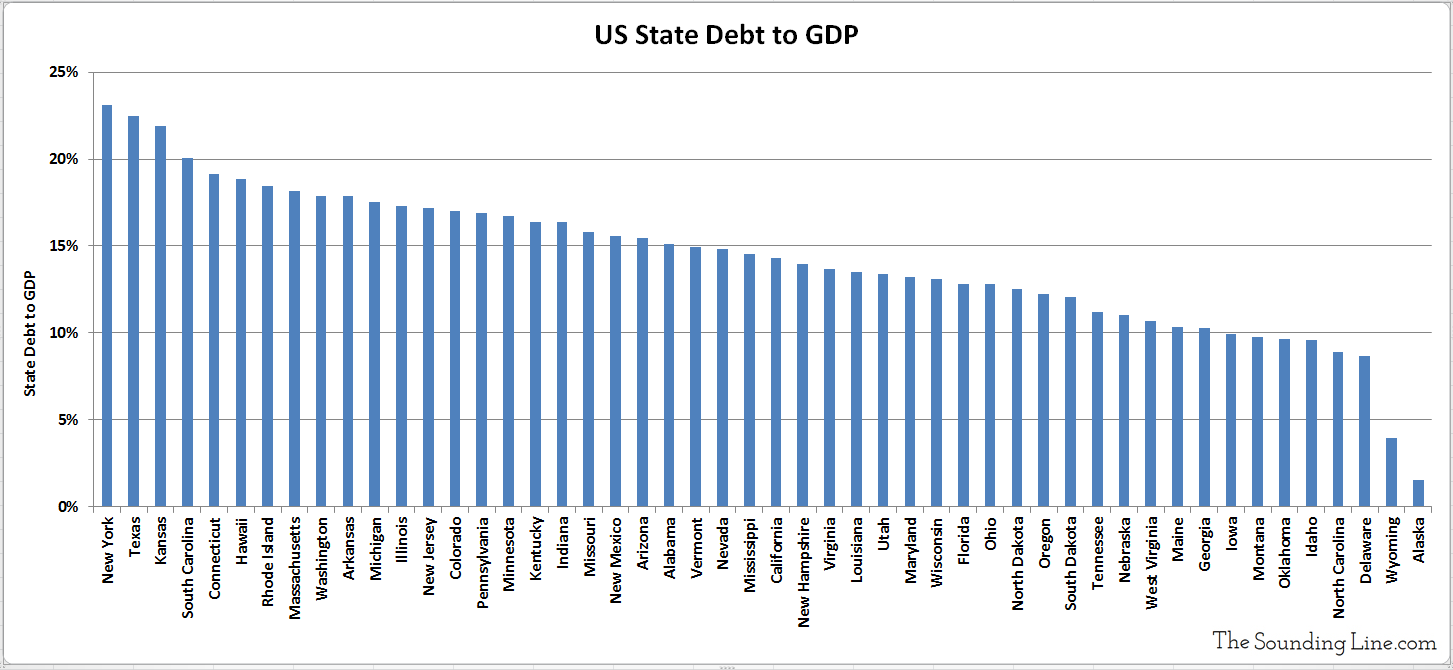
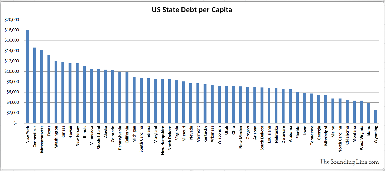
As we recently discussed for a hypothetical resident of New York City, these additional layers of debt can be quite significant, even when excluding unfunded liabilities. Therefore, using data from USDebtClock.org, we have complied a chart of the debt-to-GDP ratios for each state in the US, as well as the debt-per-capita. As the following charts show, the indebtedness of US states varies widely, with New York, Connecticut, Massachusetts, and Texas being the proportionally deepest in debt and Alaska, Wyoming, Idaho, and North Carolina being in better shape.


We have also created the following map to better visualize the debt-to-GDP and debt-per-capita of the US states. The map is color coded based on the debt-to-GDP of each state (green=low, red=high) and if you click on a state, it should reveal the percentage and amount owed per capita.
When considering the the issues surrounding government debt, don’t make the mistake of neglecting state and local debts. While central governments can turn to central banks in order to finance ever increasing debts, state and local governments do not have their own central banks and thus do not exercise sovereign control over their money supply. Also keep in mind that the debts presented in these charts do not include unfunded liabilities to welfare programs, retirement funds, and the like, which further multiply the problem.
P.S. We recently added email distribution for The Sounding Line. If you would like to be updated via email when we post a new article, please click here. It’s free and we won’t send any promotional materials.
Would you like to be notified when we publish a new article on The Sounding Line? Click here to subscribe for free.

