Submitted by Taps Coogan on the 31st of December 2019 to The Sounding Line.
Enjoy The Sounding Line? Click here to subscribe for free.
Enjoy The Sounding Line? Click here to subscribe.
With 311 articles and roughly 5,000 Top News Stories submitted since the start of the year, 2019 is officially coming to a close here at The Sounding Line. As always, it’s been a genuine pleasure writing and curating the news for you. Thank you very much for your readership and support.
I would also like to extended a special thanks to the readers who have donated to The Sounding Line this year. Your support makes a world of difference. Thank you as well to the numerous websites that have shared and linked to The Sounding Line articles this year. In particular, I’d like to thank 321Gold.com, which was our top independent website referrer this year.
If you enjoy The Sounding Line, please consider recommending it to a friend and, as always, if you would like to be updated via email when we post a new article, please click here. It’s free.
With no further adieu, here are my favorite charts of 2019, in no particular order:
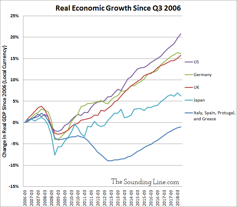
1.) A never ending stagnation: A decade later, Southern Europe’s economy is still smaller than it was before the Financial Crisis.
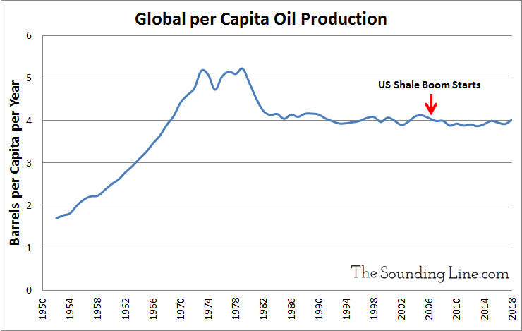
2.) Global per capita oil production peaked in the early 1980s and is lower now than before the US shale boom started. Perhaps the decline in oil prices has less to do with supply and more to do with demand.
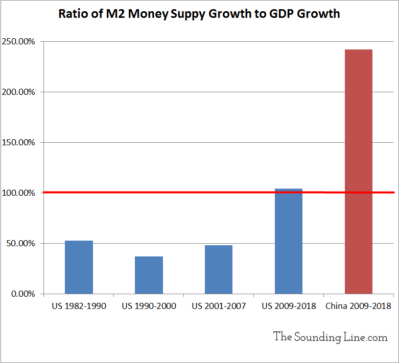
3.) History’s biggest bubble: China’s money supply has outgrown its economy by two fold since the financial crisis and outgrown US money supply by over three fold (despite China having a smaller economy than the US). Whatever eventually replaces the US Dollar as the global reserve currency, it isn’t going to be the Chinese Yuan.
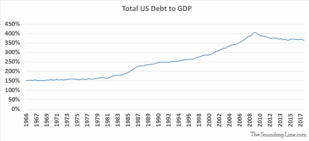
4.) Despite lots of important caveats on these statistics, US household debt-to-GDP has fallen 20% since the financial crisis and household interest expenses have never been this low relative to household income. Total US debt-to-GDP, which includes financial, government, and corporate debt, has also fallen from roughly 405% to 365%.

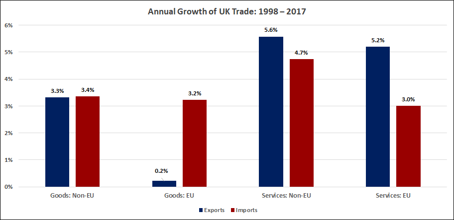
5.) Over the last 20 years, inflation adjusted UK goods exports to the EU have grown at an annualized pace of just 0.2%. Meanwhile, imports from the EU into the UK have grown by 3.2%. Any way you slice it, the EU customs union, which governs goods not services, has not been a growth market for the UK in a very long time.
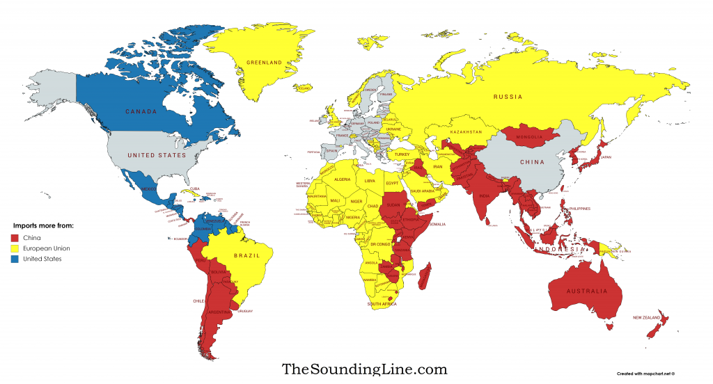
6.) Whether every country imports more from the US, the EU, or China:
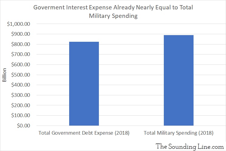
7.) Local, state, and federal interest expenses on government debt are 93% as large as all defense spending in the US.
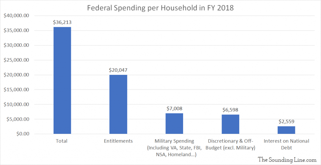
8.) Total US federal entitlement spending per household exceeds the average household poverty line in the US ($19,200). The government doesn’t need to spend more on entitlements. It needs to waste less on corruption and poorly designed programs.
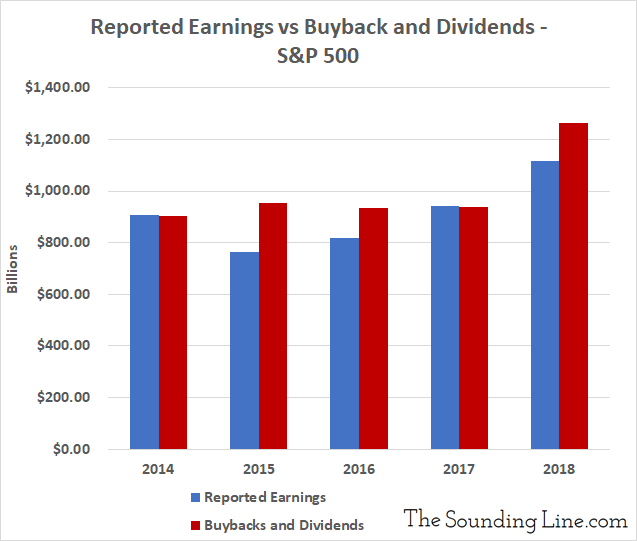
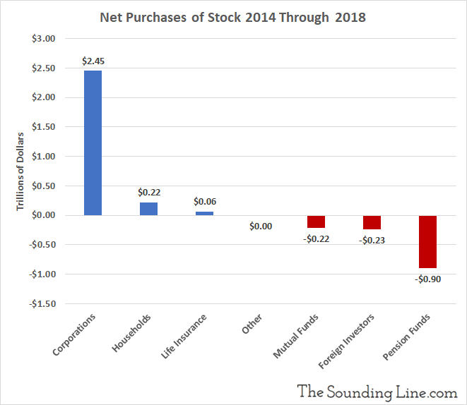
9.) Dividends and buybacks for the S&P 500 companies are now larger than all reported earnings for the S&P 500 companies. Higher borrowing costs would be an extinction level event for this bull market, which is built on companies borrowing money to repurchase shares.
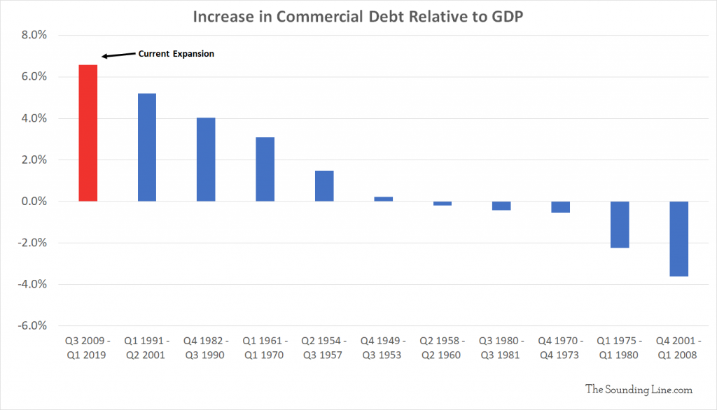
10.) The post financial crisis era has seen the largest increase in US commercial indebtedness on record, relative to GDP.
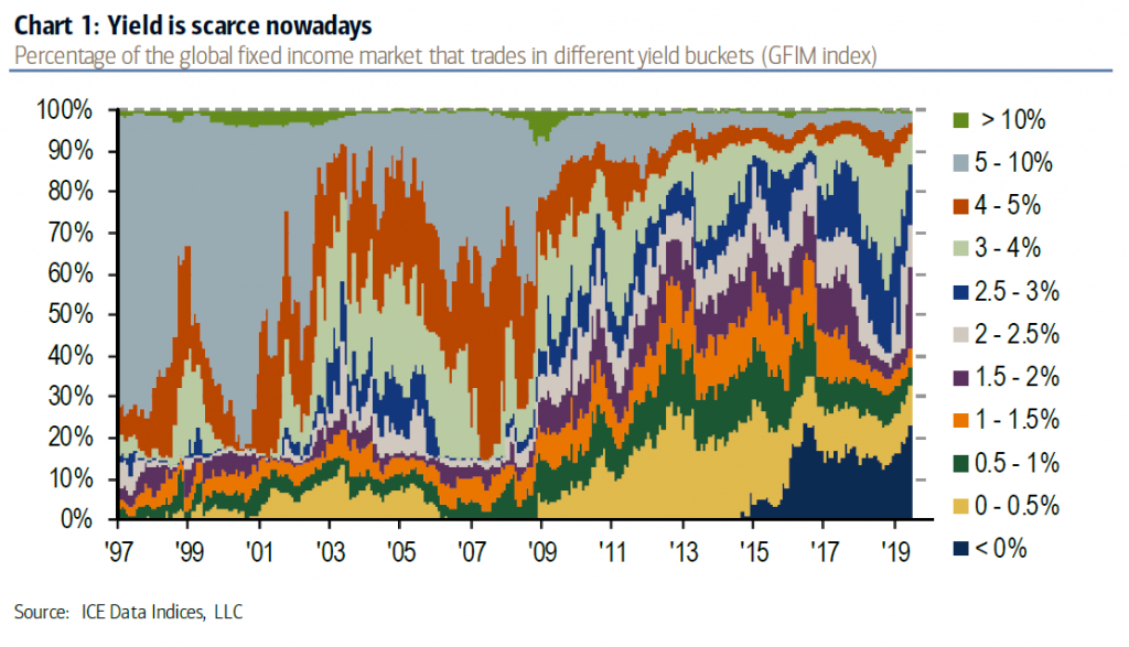
11.) In 1997, 70% of global fixed income yielded over 5%. Today, less than 5% yield over 5% and 70% yield less than 2.5%. Pension funds looking for 7.5% annualized returns are doomed to insolvency. That includes the Social Security Trust Fund which will start shrinking in 2020.
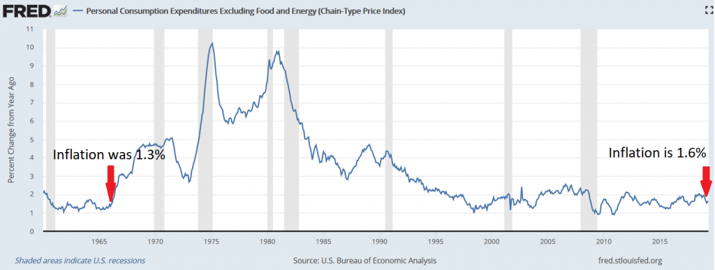
12.) In 1966, inflation was lower than it is today. Within a year, it was over 3% and on its way to 10%. It wouldn’t get back below 2% for 30 years. Central banks aught to be more careful what they wish for. Someday, inflation will return.
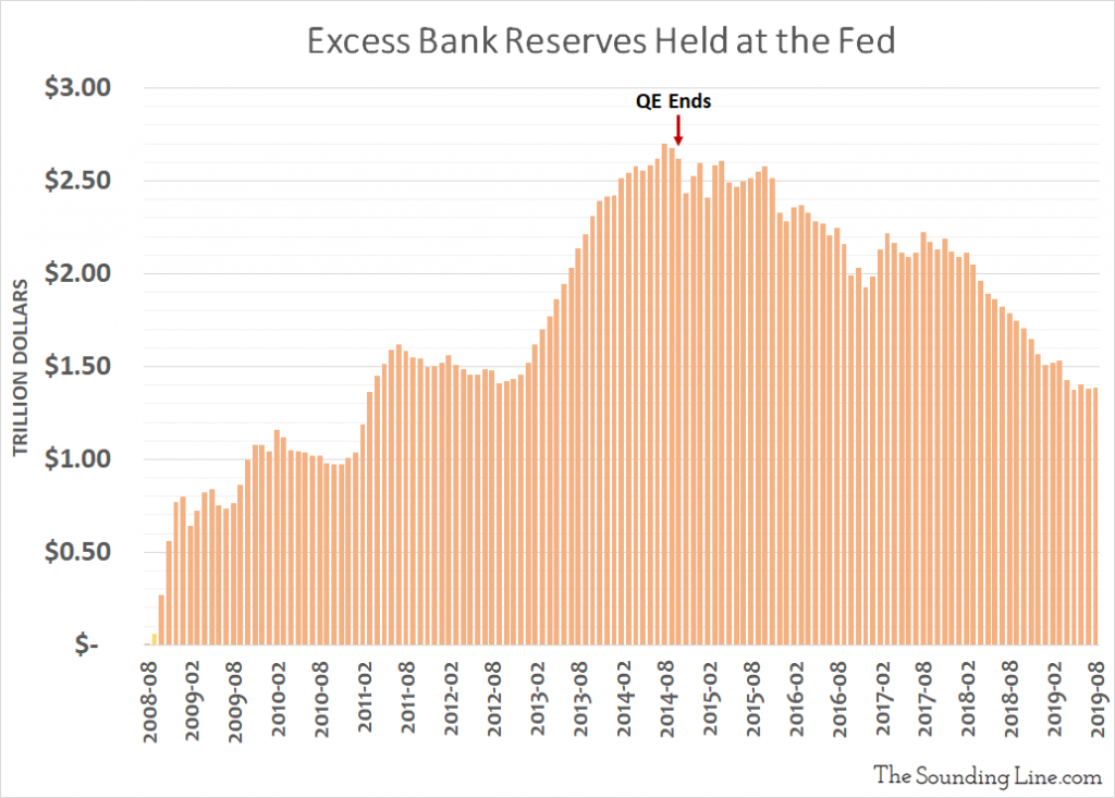
13.) Repeatedly, we warned about the risk that falling excess bank reserves posed to the repo market, before the repo blowout in September.
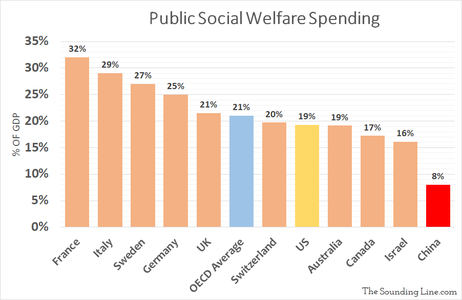
14.) The US spends over twice as much of GDP on welfare as ‘communist’ China. France spends four times as much.
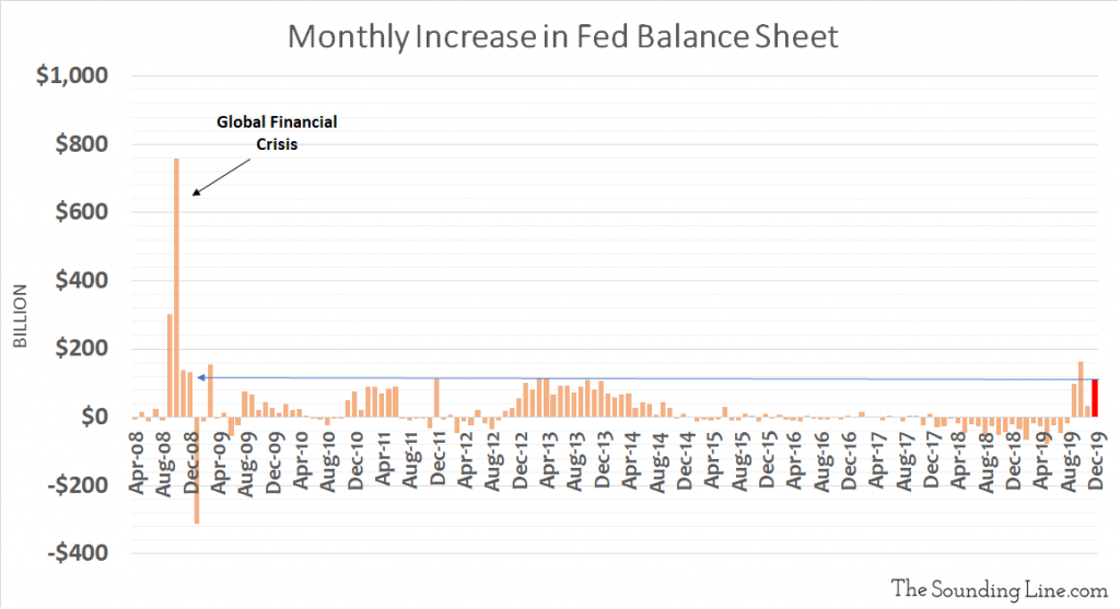
15.) The Fed’s balance sheet is growing at the fastest pace since the height of the Global Financial Crisis and has increased by $405 billion since August. It’s no wonder stocks are going through the roof. What will happen when all those temporary repos expire in early 2020? We’ll find out!
Here were my favorite charts from 2018 and 2017. Best of luck in the new year!
Would you like to be notified when we publish a new article on The Sounding Line? Click here to subscribe for free.
Would you like to be notified when we publish a new article on The Sounding Line? Click here to subscribe for free.


Taps, thanks for the great charts and may the new year shower you with happiness and good fortune!.
Thanks and thanks for all the great articles over at Advancing Time (http://brucewilds.blogspot.com/). Great site.
Great stuff on this website, thanks for all the info
My pleasure. Thanks for reading